“Every interaction, in any form, is branding.” Seth Godin
At Idea Kraft, one of the most repeated mantras we have when kicking off a branding project is that a logo is not the only element of branding. While the words “brand” and “logo” are often used interchangeably, a logo is just a piece of the brand. It may be the most forward-facing piece, but it works in unison with many other elements to create a brand in its entirety. If all the elements are not considered, you may end up with a weak brand that takes away from your brand experience. If your overall brand is disjointed, you won’t resonate with the audience that you’re trying to reach.
In this series, we will take a look at all the elements that build a brand: Color, Photography, Typography, Illustrations, Tagline, Voice, and Culture & Values. These elements should be used together in a cohesive and thoughtful way that not only solidifies your brand but elevates it.
For more information and an interactive guide on how to create your brand from the ground up, email us for a copy of our Build Your Brand guidelines.
ILLUSTRATION
In recent years, the addition of illustration to a brand’s arsenal has become much more common. From large corporations to small businesses, illustrations are making a comeback and providing yet another avenue for a brand to showcase their voice and personality.
The use of illustration really lends itself to making a brand feel more personal and likeable. While photography may be the standard for many companies, choosing to use illustration sets that company apart and can make them more unique. Standing out from your competitors is critical in creating a successful brand. By using illustrations, you can create a style that is individual and unique to you. Illustrations also allow you to create an image that is very specific and can add clarity to a complex idea that you wouldn’t be able to do with a photograph.
If you’re looking to add illustration into your brand’s toolkit, check out these inspirational examples to help you build a better brand.
1 – Atlassian
Despite the fact that Atlassian is firmly rooted in the corporate world, with its software and collaboration tools, their visual approach is anything but buttoned up. Through the use of brightly colored digital illustrations depicting teamwork and collaboration, they’ve made it easy and engaging for people to understand what they do, while still being professional.


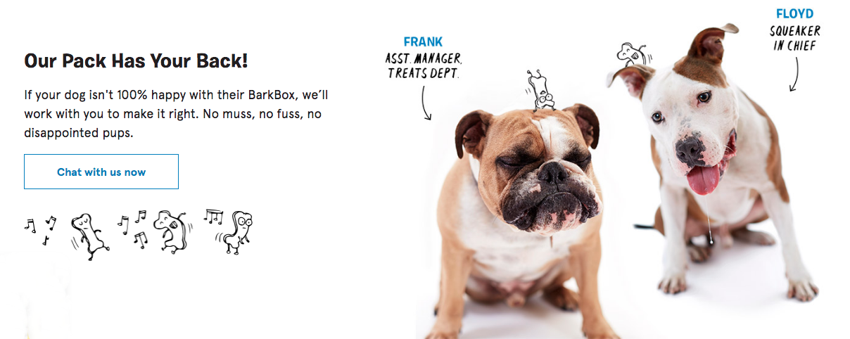
2 – BarkBox
When you specialize in providing dogs with boxes of toys, it goes without saying that your branding should be fun! Barkbox uses a combination of playful illustrations, with handwritten style typography, and photographs to create a cohesive visual identity.
3 – Headspace
As a company that focuses on mental well-being, Headspace uses happy and peaceful characters to create a look that is approachable and beneficial. Paired with a calming color palette, the illustrations support the circular logo for consistency in brand execution. This look makes it easy for users to get comfortable with a service they may be unfamiliar with.


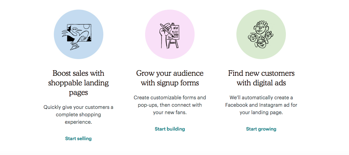
4 –Mailchimp
To stand out from the crowd, sometimes going in a more quirky direction is needed. Mailchimp has incorporated whimsical illustrations that have a rougher, more hand-drawn and organic feel. These illustrations are incredibly unique and do an excellent job of using visual language to capture the intricacy of the verbal narrative. Mailchimp also excels at using these illustrations consistently across all their platforms.

5 –Play Brew
One way to make your illustrations stand out is to give them a retro edge. Throwback styles are a fun way to give life to your brand in an unexpected way. Play Brew’s packaging screams 80’s nostalgia with funky characters, over the top colors, geometric shapes, and bold typography.


LEARN MORE
Email us today to discuss your branding project or to get more information on how to build your brand!
Your inbox needs more Idea Kraft.