Last week, we kicked off this series explaining the major areas where custom design is crucial for a successful e-commerce website.
The growth of any business largely depends on your web presence. Whether a corporation, small business or anything in between, every company has unique goals—and while inexpensive templates help to get your website up and running, they don’t serve your goals specifically.
This is where the value of professional web design comes into play. Our combined experience working with clients, in the industries covered in this series, has allowed us to pinpoint where design can influence your key performance metrics (KPIs) most.
This week, we’ll be covering must-haves for a successful website in education.
1. Credibility
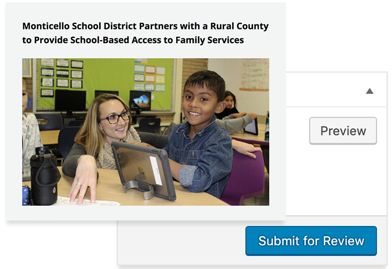
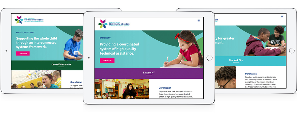
In education, audiences are looking for a credible, informative website. Whether a college or university, a private school, or a resource for professionals, you need to earn the trust of your visitors. This can be done by setting up a system that allows for various administrative roles on the website’s back end. Some of our clients have an editorial review process, where many staff members can easily write an article, but it needs to be approved by someone on their staff before it is published.
Read more about the NYS Community Schools Technical Assistance Centers website we established for the NYSED initiative, featured above, here.
2. Maintainable content
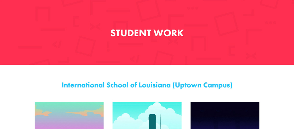
A sustainable website factors in the costs associated with internal upkeep. If you invest in a maintainable website, less time will be spent training staff, managing PR (public relations) and dealing with any crisis down the road-and more time can be spent delivering value, marketing successfully, and nurturing prospects.
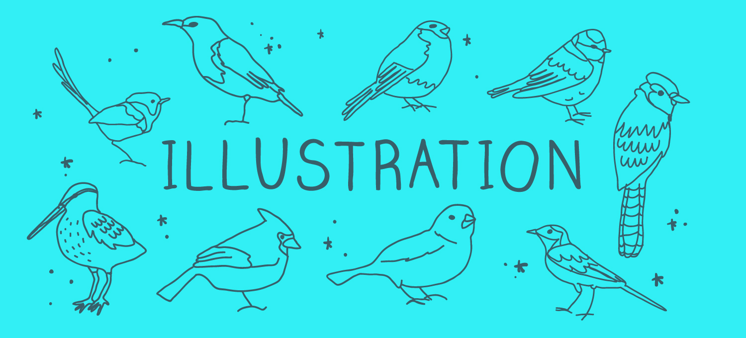
Read more about the organization for computer science education in New Orleans, featured above, here.
3. Diverse and authentic imagery
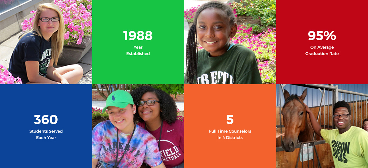
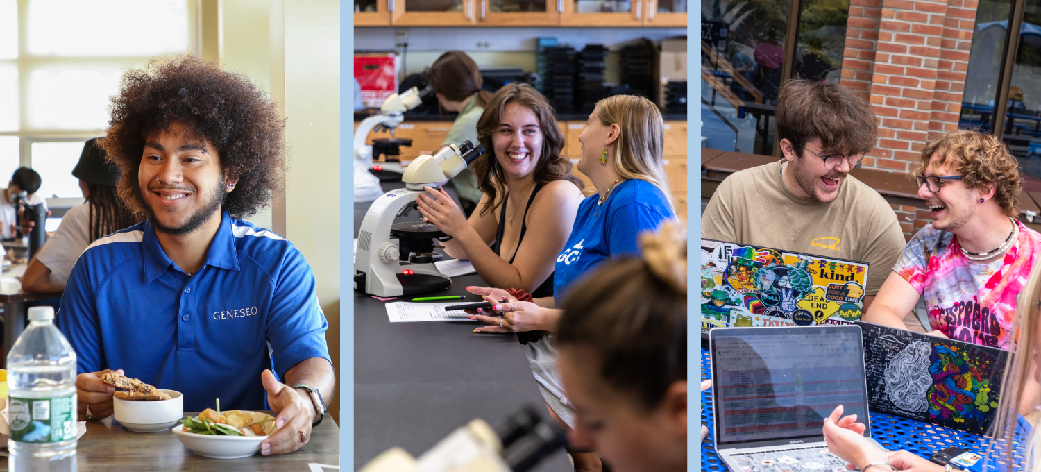
Audiences need to feel invested in your school or organization. This means designing for user types such as prospective students, current students, parents and influencers, and donors. Virtual tours and diverse, authentic imagery help prospects see themselves as part of your organization.
See more from our photoshoot, and read about the work we’ve done for Liberty Partnerships Programs, here.
4. Organized information architecture (IA)
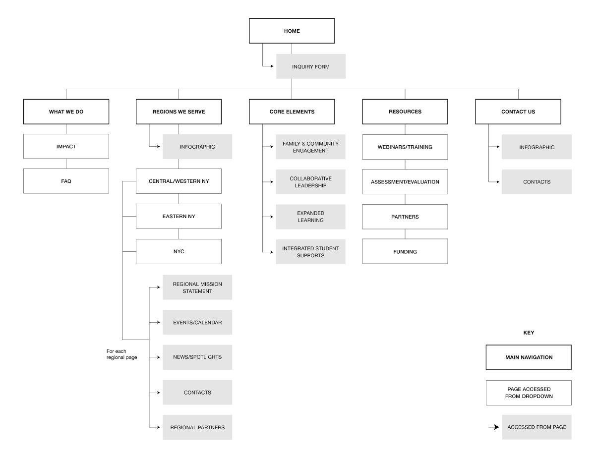
Users visit your website with a primary goal and if they can’t achieve it quickly, you lose their business. Never underestimate the power of information architecture. It’s the framework for creating a meaningful website experience. If someone can’t navigate the application process or find the degree program they’re looking for, it hurts your brand.
The above is a sitemap, which maps out the paths that visitors take to navigate your website.
5. Brand consistency
In education especially, there is a community of individuals shaping your brand. If they feel connected to it, they become brand ambassadors. A consistent web presence, from voice and tone, to visual design and reusable components, allows these individuals to promote your brand as whole.
Stay tuned! Next week we’ll share some of the must-haves for a successful website in the food and beverage industry.
Your inbox needs more Idea Kraft.
