Higher Ed / Case Studies / Education / UX/UI / Web Design / Web Development
How We Helped Syracuse University’s Newhouse School with Accreditation: Designing an Interactive Self-Study Report
The Newhouse School at Syracuse University was up for reaccreditation, and their self-study report needed to be reinvented to meet modern accessibility requirements. Their last report was a 600-page PDF back in 2015, but this needed to be upgraded to an interactive format that would prioritize usability and ease of navigation.
This is where we came in. One thing we pride ourselves on is designing websites that get to the heart of client needs, so they not only look beautiful, they accomplish your unique (and sometimes complex) goals. In this case, our mission was to design a solution that would satisfy new accrediting guidelines, and provide the best user experience for both Newhouse to populate content, and for the accrediting council to navigate the report.
Planning for Future Content
One challenge Newhouse faced was that they needed a well-designed website for the information required of them before they actually input that information. They had the questions from the accrediting council, but they needed the site designed first in order to input the answers and supporting data tables and documents. To accomplish this, we started by gathering information including user feedback, past data reports and new guidelines. Then we came up with a sitemap based on a list of questions from the accrediting council.
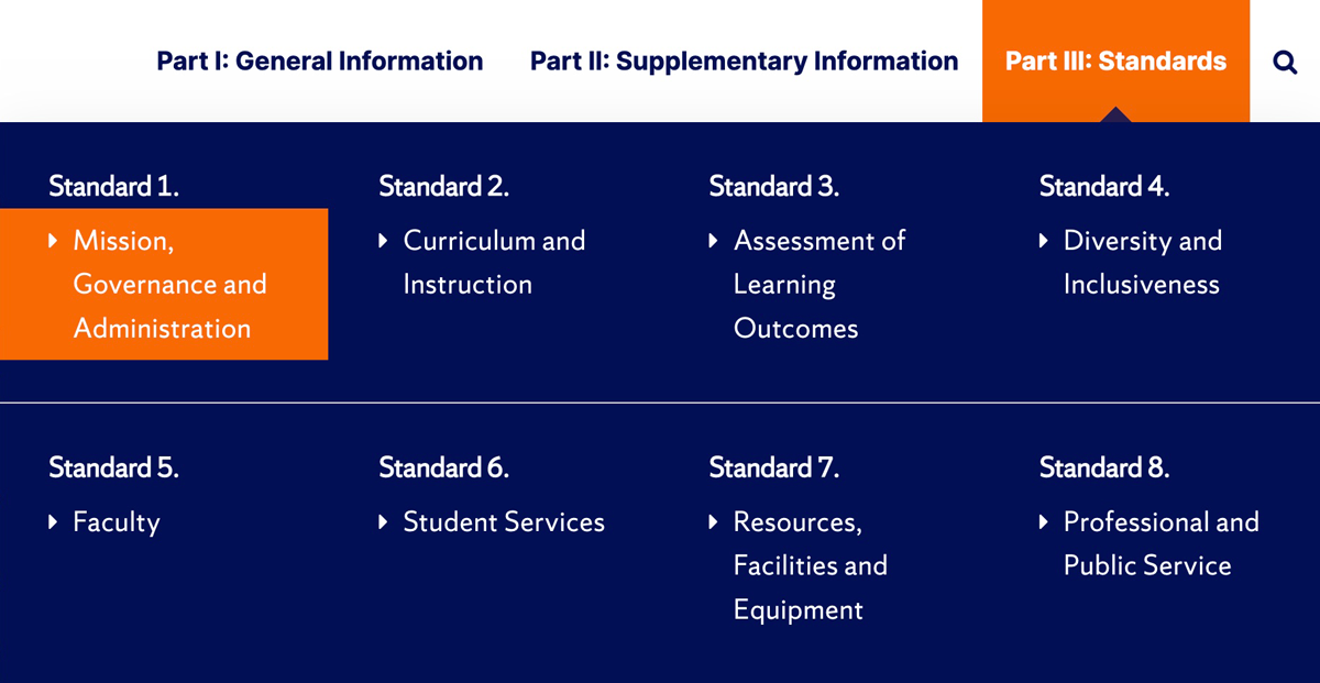
Mega menu design for self-study report website
Taking into consideration how Newhouse would be using the site and how the accreditors would be using it, we designed a navigation system that would save both groups of users time and make their jobs easier. From there, we created a foundational content matrix for Newhouse to fill in with sample content for one of the nine standards. Each standard would follow a similar format, so we were confident that this outline would enable us to design a solid foundation for the full website.
Ease of Use for ACEJMC
The Accrediting Council on Education in Journalism and Mass Communications (ACEJMC) had unique user needs. In addition to being able to efficiently navigate informational content, they required all questions associated with each standard to be fully visible and searchable. This meant taking lengthy content and making it easy to scan visually without hiding any of it using collapsable toggles.
Typography and hierarchy was key. We incorporated quick links for accreditors to jump to specific answers as needed and clear headlines to delineate sections of content. We also made sure that the navigation included clear indicators of where a user was within the hierarchical structure of the website.
ACEJMC wanted links to open in a separate window so they could view both the narrative and supporting document at once, so we set up supporting document links this way and also included anchor links for on-page sections. This reduced time spent scrolling. All sections were clearly labeled and included tables which could be easily updated.
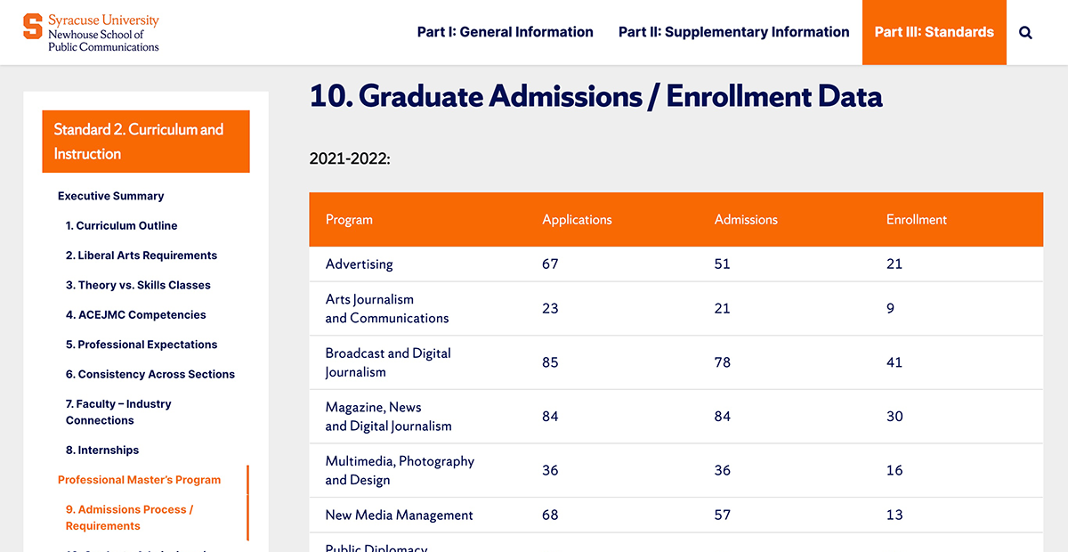
Local navigation menu and Standards example
Quality Assurance
Every step of the way, we collaborated with Newhouse for their review and feedback. Typically we’ll present a homepage and key subpage design before proceeding with development, and in this case that key subpage was a page for one of the standards that covered all types of content (including various tables). Some additions and changes we made during feedback rounds included adding a live search feature and adjusting the search results page menu. We ensured the website followed Syracuse University’s brand guidelines and met WCAG 2.1 AA accessibility standards. We also tested for mobile and tablet use, defined user roles and conducted a training session. Newhouse and the accreditors provided excellent feedback, and were very happy with our solution to a complex navigation challenge. They even said they loved the front and back end more than any other content management system (CMS) or WordPress website they’ve used.
“Our accreditor referred to our self-study as ‘a work of art’ in their final report. They loved how easy it was to access information and find what they needed.” —Aileen Gallagher, Associate Professor and Chair, Magazine, News & Digital Journalism, S.I. Newhouse School of Public Communications
Interested in how we can help you accomplish unique goals? Get in touch.
Your inbox needs more Idea Kraft.


