Strategy / UX/UI / Web Design
6 trends shaping the web in 2022
2020 saw years of digital transformation compressed into a few months, as pandemic lockdowns forced brands to abruptly pivot to a digital-first strategy. According to McKinsey, brands in 2020 were three times likelier to report that 80% or more of their customer interactions were digital. And the trend towards digital-first experiences didn’t slow down in 2021, nor is it showing signs of slowing down in 2022. Need to upgrade your web presence for this new digital-first reality? Read on for Idea Kraft’s round-up of the six most important trends defining the web this year.
Trend #1: Scrollytelling
Scrolling has become synonymous with boring. If you want to grab someone’s attention in 2022, try scrollytelling. Scrollytelling is a form of narrative that transforms longform content into an interactive experience. As a user scrolls through a page, a dynamic interplay of text, imagery and sound unfolds on screen. The genius of scrollytelling is that it’s so effortless on the part of the user— there’s no second-guessing what to click in order to get to the information you need. Simply scroll and watch the story unfold!
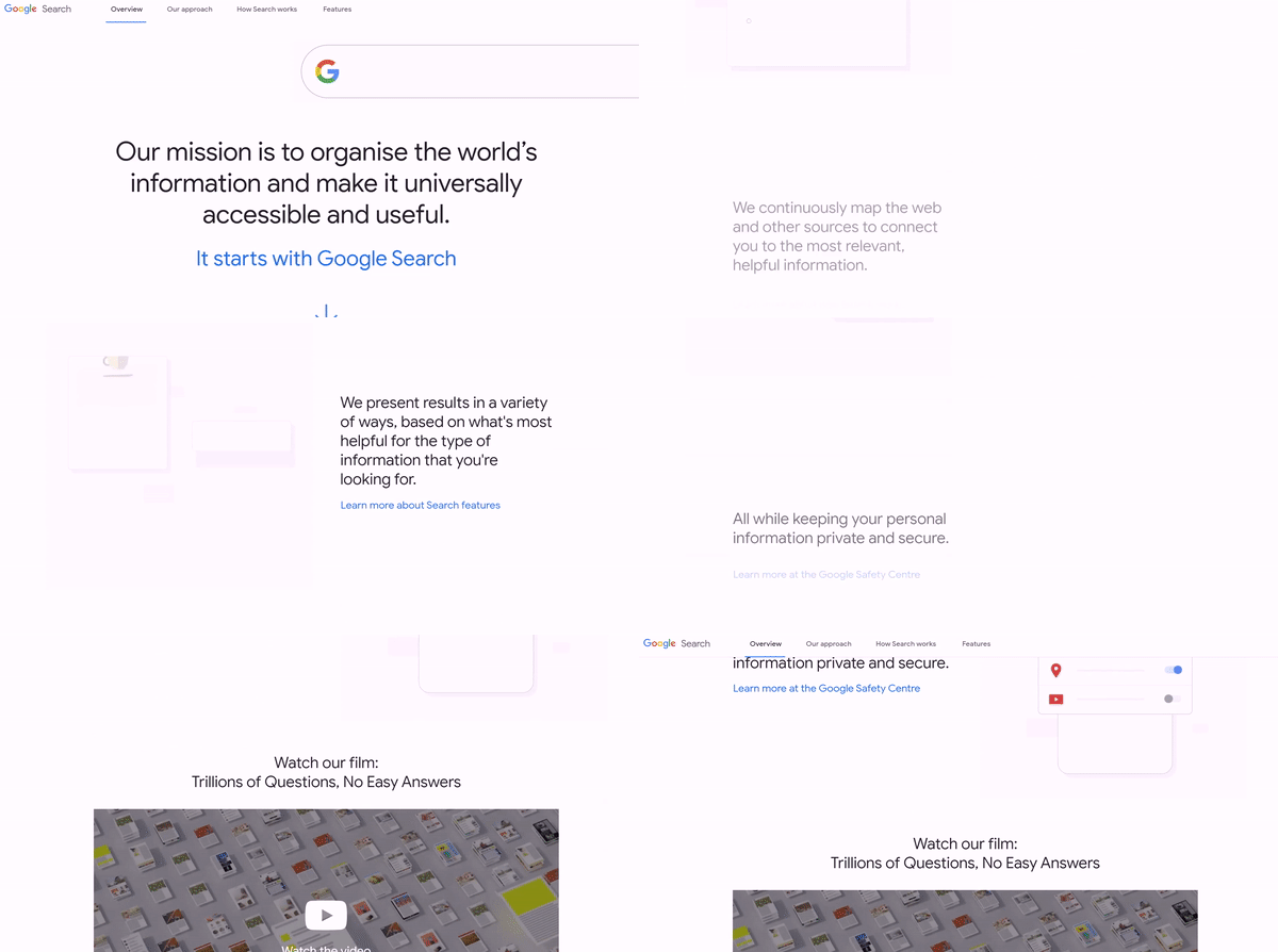
Scrollytelling via Google.
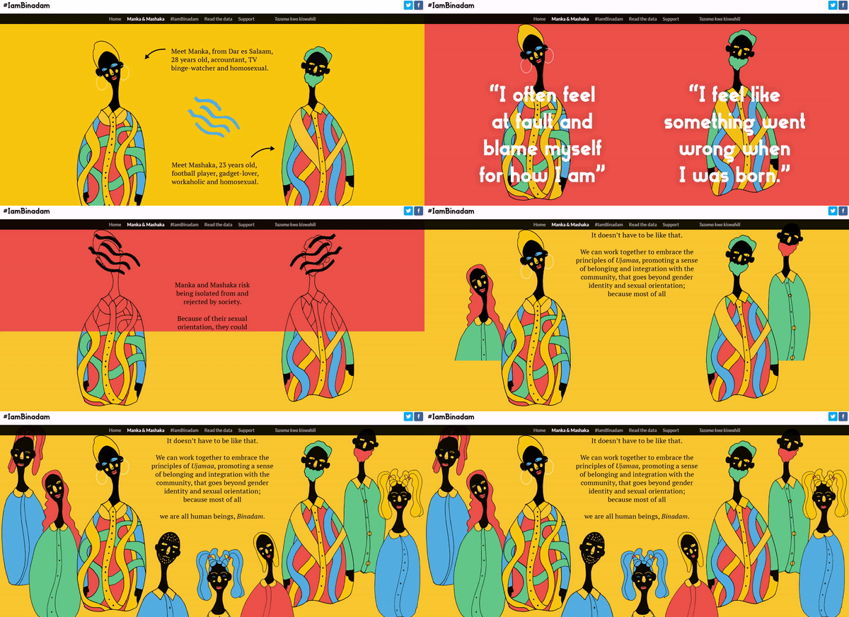
Crazy good scrollytelling via #IamBinadam.
Trend #2: Animated Logos
Want to breathe new life into your logo, but can’t commit to a redesign right now? Shake it up with motion. Animated logos are on the rise, and it’s no surprise given animation’s popularity across the creative industry in 2021. Explore how your logo can spin, bounce, warp and transform into something new and unexpected through motion design. Remember— the best animated logos are not those that use fancy animated effects just for the sake of it. The best ones communicate a deeper meaning about your brand. They’re meaningful, evocative and pop right off the screen.

Logo animation for AMT by Idea Kraft.
Trend #3: Microinteractions
The devil is you-know-where! Microinteractions are small, engaging interface changes that help users navigate a website. These small design details serve as prompts for the user— they show what happened, what will happen or what needs to be done next. Their strength lies in their ability to speed up and simplify the user experience. Plus, they can improve your SEO. Google gives preference to dynamic content in its search rankings. Play with color, animation and hover effects when designing user interfaces in 2022, but keep in mind that all elements need to work together in harmony. The goal isn’t to impress users with fancy design gimmicks; it’s to facilitate a better user experience.
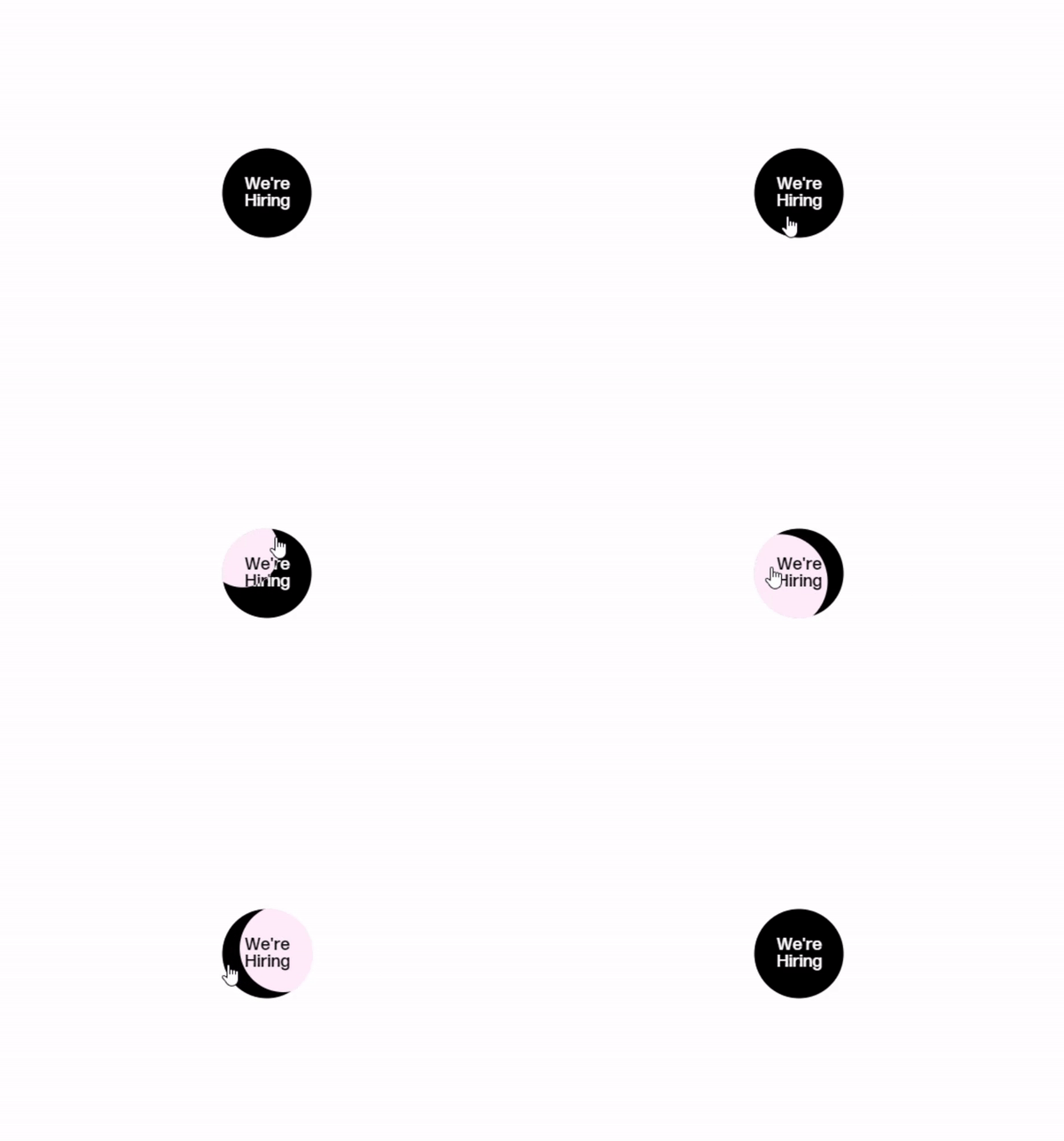
Hover effect via Awwwards.
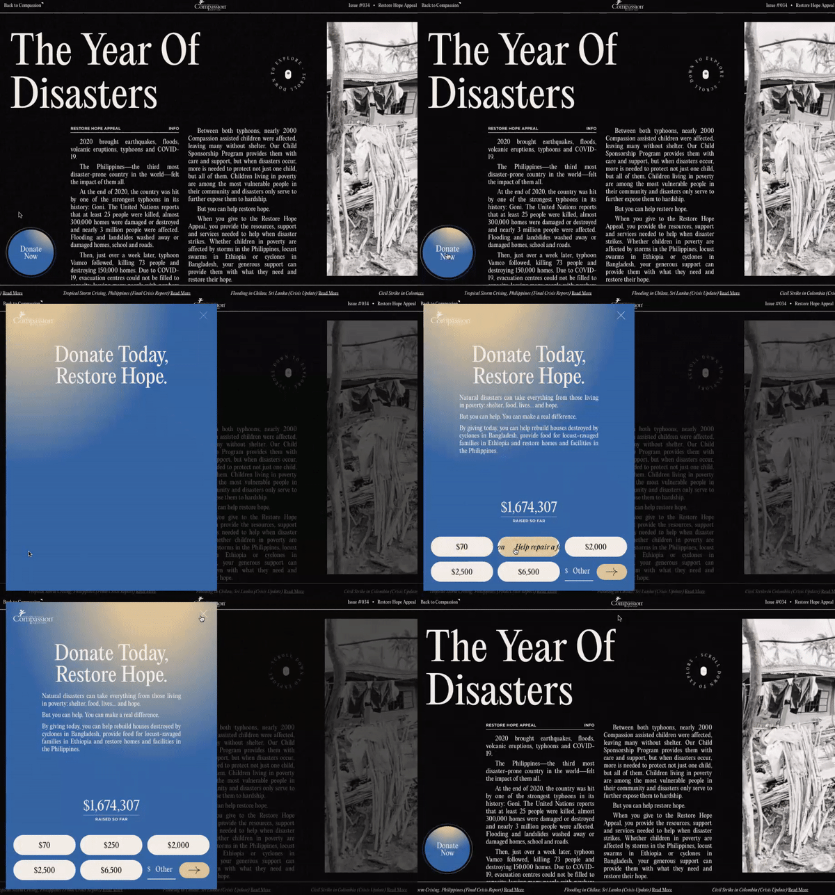
Dynamic CTA via Awwwards.
Trend #4: Dark Mode
Did you know that the first computers used what we now know as dark mode? But to encourage wider adoption of computers, interfaces adopted light mode to mimic books and newspapers— i.e. black text on a light background. Dark mode has been making a steady comeback among users and designers alike in recent years, thanks in part to early adoption by big players like Apple, YouTube and Google. Dark mode isn’t a cyclical trend though. In an era where we’ve never spent more time looking at screens, many claim dark mode reduces eye strain (although the science is still a little murky). Plus, dark mode is more energy efficient. Expect to see predominately dark color palettes become the default in 2022.
Trend #5: Out-of-the-box typography
When it comes to typography in 2022, your imagination’s the limit. Feel free to throw out the rulebook and get creative— everyone else is! Try mixing different fonts and colors and playing with shapes and motion. But don’t forget— headlines need to be legible above all else. Big text will continue to be a leading trend this year, but expect to see more and more subtle splashes of style in the form of italics or underlining.
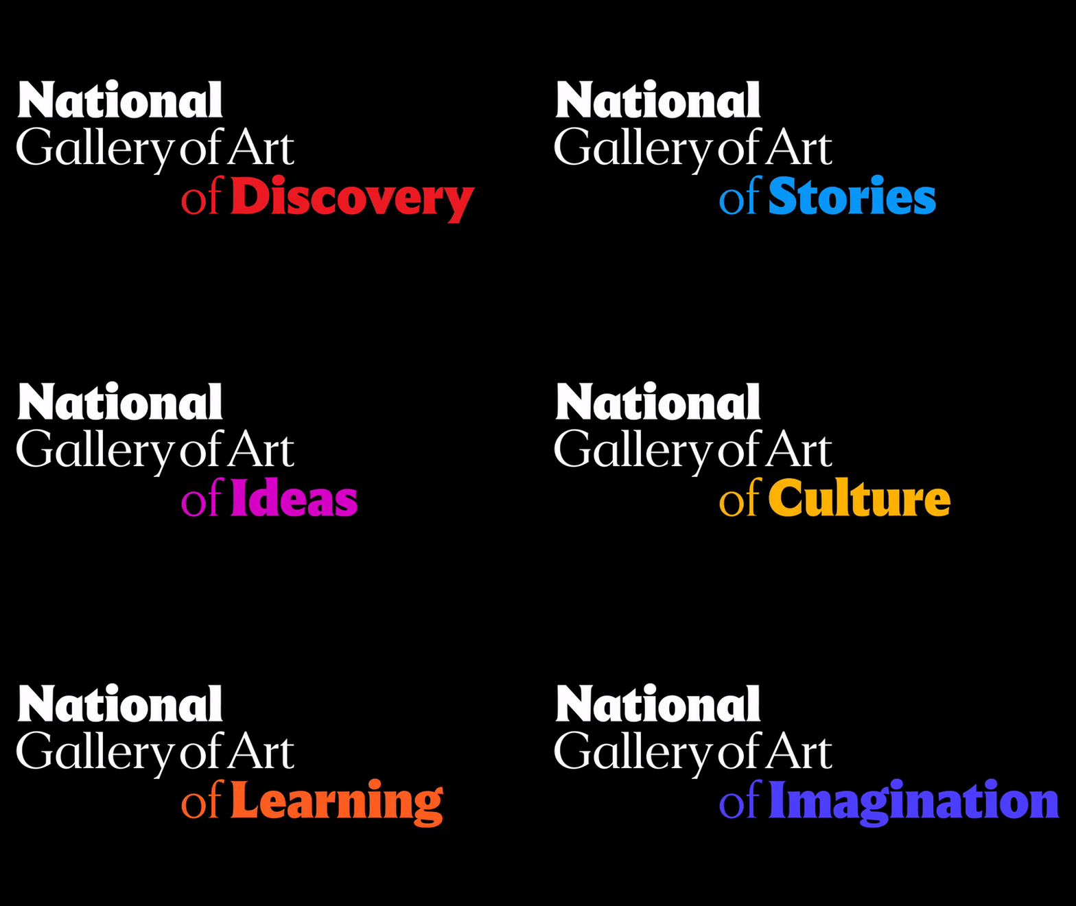
Bold type via the National Gallery of Art.
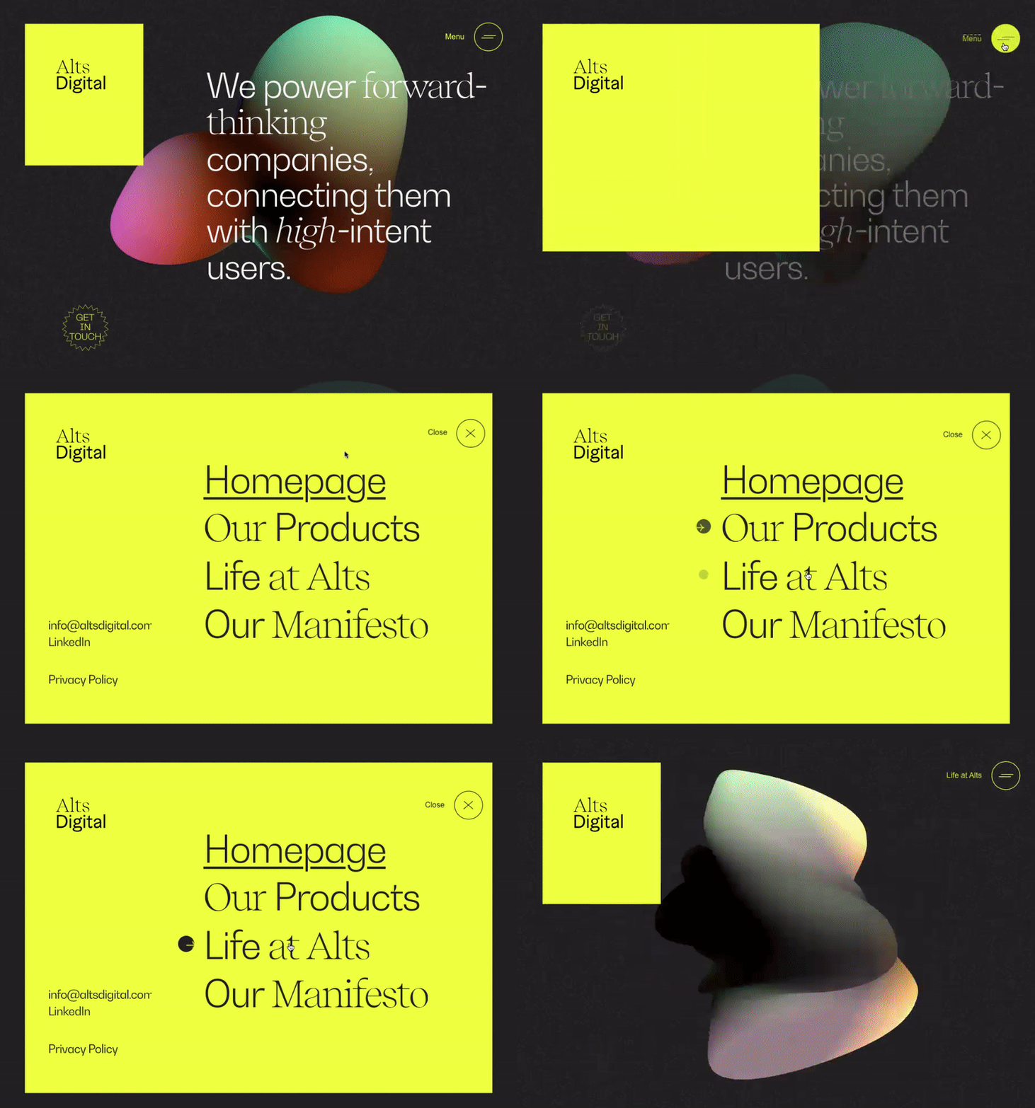
Mixed fonts and subtle stylizations via Awwwards.
Trend #6: Responsive design
Once upon a time, designers used to create two versions of a website— one for desktop and one for mobile. Typically, the mobile version was just a smaller version of the desktop version. This won’t cut it in 2022. With 54.4% of web traffic coming from mobile devices in 2021, your website needs to be designed with mobile front-of-mind or you’ll risk users bouncing. The easiest and most efficient way to guarantee a consistent experience across differently sized screens is fully responsive web design. This approach allows your website to adapt to the size of any screen it’s being viewed on— like a desktop, phone or tablet— and users won’t experience any differences in functionality or overall experience. With responsive design, your website renders properly to anyone who visits it, no matter how they are visiting.
The takeaway
Because of its relationship with technology, web design presents the perfect opportunity to experiment with future-forward innovations in animation and interactive elements. As we spend more and more time online, web designers will need to get creative in order to grab (and hold) our attention. Web designers will have plenty of room to experiment this year, but the user experience should always take precedence over novel aesthetics.
Want more? Check out all of our 2022 trend reports.
Your inbox needs more Idea Kraft.

