“Every interaction, in any form, is branding.” Seth Godin
At Idea Kraft, one of the most repeated mantras we have when kicking off a branding project is that a logo is not the only element of branding. While the words “brand” and “logo” are often used interchangeably, a logo is just a piece of the brand. It may be the most forward-facing piece, but it works in unison with many other elements to create a brand in its entirety. If all the elements are not considered, you may end up with a weak brand that takes away from your brand experience. If your overall brand is disjointed, you won’t resonate with the audience that you’re trying to reach.
In this series, we will take a look at all the elements that build a brand: Color, Photography, Typography, Illustrations, Tagline, Voice, and Culture & Values. These elements should be used together in a cohesive and thoughtful way that not only solidifies your brand but elevates it.
For more information and an interactive guide on how to create your brand from the ground up, email us for a copy of our Build Your Brand guidelines.
TYPOGRAPHY
When it comes to typography, it can play either a bold or subtle part of your branding. Some brands are all about that type, while others use it in a restrained or utilitarian fashion. It can be the main element of your logo or the supporting character that rounds out the brand. Typography plays just an important role in defining brand personality as more visual elements such as color and illustrations do. Is your business playful and geared towards a younger audience? If so, a font like Helvetica might not be the best fit. Alternatively, if you’re a cutting edge manufacturing business, Comic Sans is not going to project the image of authority and expertise you need to succeed. Typefaces all have different personalities that they project and need to be used wisely when creating a brand identity.
In addition to considering the emotions they depict, typefaces need to be the workhorse of your brand as well. You don’t want to choose a typeface that is only available in a bold weight or has no numerals. Legibility is also key here – a quick test is to look at the I, i, and 1. Does the capital I look just like the lowercase i? Do those both look like the numeral 1? If so, you may need to find a font with more variety.
Regardless of how you’re using type in your brand identity, consistency is everything. A successful brand not only defines the typefaces they use but creates brand guidelines that dictate how the fonts are used, down to the spacing rules, sizing, and alternative substitutions for print and web. By creating a thoroughly defined brand guidelines document, you will never doubt which font to use, and your brand will be stronger because of it.
This week, we’ve rounded up a collection of typography in design that goes beyond the logo, including some examples of brand guidelines to inspire you on how to use fonts in your next project.
1 – Audi
As a premium brand, it is imperative that Audi’s look is not only upscale and cutting-edge but credible and recognizable as well. In order to achieve this, they ended up creating their own typeface, Audi Type, with the main font being Audi Type Extended Bold.


2 – Fisher Price
As mentioned above, finding the right font for your audience is key. For Fisher Price, that meant using a typeface that has a playful sense of fun, in both the logo and the marketing materials and website. The custom typeface captures that sense of joy and silliness that Arial or Bodoni just wouldn’t do.


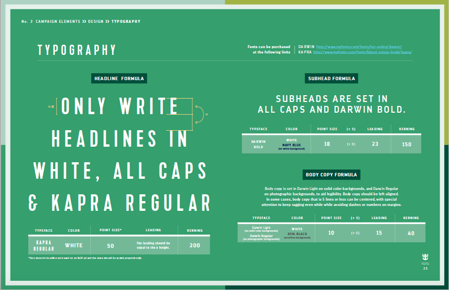
3 – Royal Caribbean
If creating a custom typeface is out of the question (it usually is), then using type foundries is also a great solution! Royal Caribbean uses readily available fonts Gotham, Darwin, and Kapra in a consistent manner across all materials to create a unified and consistent brand. Their brand guidelines give great specifics on how to use these fonts as well.


4 – HurlyBurly
When your product relies on an eye-catching design to make you stand out in grocery store aisles, typography provides a great way to achieve that. In addition to the color palette, the bold and unexpected use of type in the logo really makes this product pop.


5 – Lush Cosmetics
Lush does a great job of balancing two different style fonts in their brand identity. Packaging and headlines are treated with a fun and dynamic handwritten feeling font, which is balanced by the bold and modern sans serif. Both fonts are used from packaging to web to create a cohesive and balanced look.


LEARN MORE
Email us today to discuss your branding project or to get more information on how to build your brand!
Your inbox needs more Idea Kraft.