5 Ways UX/UI Design Can Strengthen Your Brand
Have you ever visited a website that felt like it was made for you? Knowingly or not, what you were experiencing was excellent UX and UI design. These design practices assist with everything from brand consistency to marketing strategy and conversion rates.
Before we discuss how, let’s answer the question:
What Is UX & UI – And What’s the Difference?
UI has to do with all the visual elements on a website or app, while UX design uses functionality to reduce or add friction that brings the user closer to a desired action. Both UX and UI ensure that a website is not mentally taxing to navigate by anticipating the visitor’s needs, intentions, habits, preferences, and potential obstacles.
That helps with brand consistency, KPIs, website traffic, and more by:
1. Removing Common Frustrations.
The last thing you want your website to do is frustrate people, but slow or inefficient functionality is likely to do just that – resulting in higher bounce rates and fewer conversions.
Best UX design practices aim to prevent this by making the entire website seamless to interact with. This can include optimizing content for the fastest loading times, making interactive elements as responsive as possible, and adding information or links users will need on any given page of a website.
UX design backed by audience research can also create pathways to a desired action that your customers will not only follow but even find helpful.
2. Optimizing for Mobile & Desktop.

An intentional layout matters just as much – if not more – to someone trying to view your website on their phone. Good UX design knows this and accounts for it.
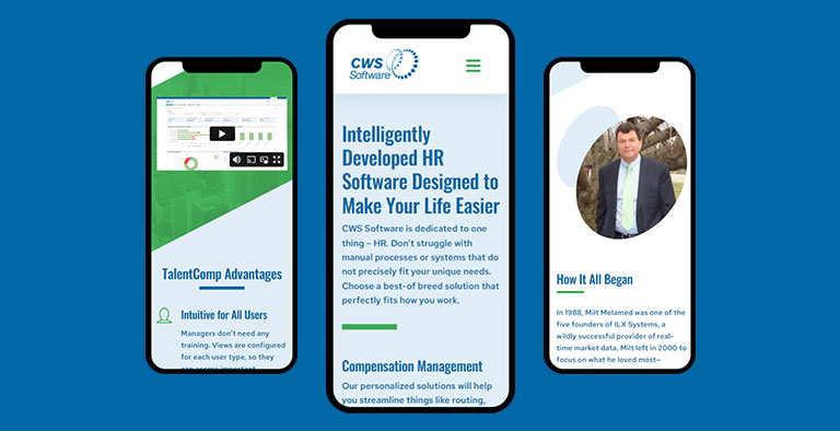
When designing the mobile version of CWS Software’s site, for example, Idea Kraft used color, graphics, and fresh visuals to break up the monotony of scrolling through text and to denote what each section is about.
In another example, people visiting the mobile version of a restaurant’s website are probably weighing their options and trying to make a quick decision. They’re going to be looking for the restaurant’s menu, hours, phone number, and address. So that’s what the homepage of the mobile site should deliver.
However, someone viewing the restaurant’s site on their desktop is likely sitting down to do research on the restaurant. That’s the perfect time to give them details, tell a story, or convey personality using more text and visuals.
3. Enhancing Messaging.
Got a great message, mission, or brand voice? UX and UI ensures your visitors take notice.
UI design uses placement, size, and other visual adjustments to make copy feel natural and easy to read. Paying attention to best UI practices will result in a more polished look, avoiding a cluttered or isolated presentation that users might pass over entirely.
Implementing a strong SEO strategy is another great way to tackle the goals of both marketing and UX. That’s because optimizing your content for the highest ranking possible proactively drives website traffic while UX helps keep people on your site.
4. Providing Accessibility.

It’s almost impossible to talk about UX design without talking about accessibility. For the unfamiliar, “accessibility” in this context refers to making websites easy and functional for everyone, including those with visual and hearing-related disabilities.
If you’re not thinking about the variety of ways people navigate the physical world, it’s easy to present barriers to people who are low vision, left handed, color blind, or hard of hearing – blocking access to the information they need.
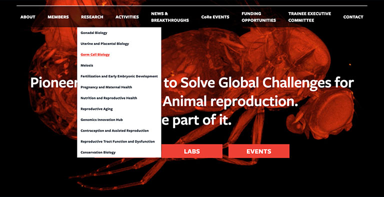
That’s exactly what Cornell Reproductive Sciences Center wanted to avoid. Idea Kraft designed a website for CoRe that organized their complex research into local site navigations and followed best practices for alternative (ALT) text, as well as visual contrast, keyboard navigation, button styles, and so much more.
Far from being an extra consideration, accessibility is fundamental to the goal of creating an overall seamless user experience.
5. Building Brand Loyalty & Consistency.
UX and UI is generally about reducing the cognitive load required of a digital interaction. Sticking to brand guidelines will make your organization’s digital presence much easier for users to absorb and comprehend.
Visual similarities help people transition to different interfaces with little to no mental effort. This is especially helpful for marketing campaigns, where you may intend for a user to follow a conversion funnel from your social media post to a landing page and then to a checkout page.
It takes effort to give your audience a top-notch experience. Make sure they don’t forget who gave it to them! Best marketing and UI practices will keep your brand top of mind subtly but effectively, acting as a catalyst for brand loyalty.
Drive results with human-centered design.
Idea Kraft has worked with all kinds of organizations – from nonprofits and state agencies to B2B and B2C companies – to improve their web presence through UX, UI, and versatile brand guidelines. Get in touch today to see how our creative agency can do the same for your organization.
Your inbox needs more Idea Kraft.


