Last week in this series, we shared the must-haves for a successful website in the food and beverage industry.
This week, we’ll be covering the must-haves for a successful nonprofit website. To make an impact, you need a website that’s built to support the unique goals of your organization. While templates help to get a website up and running, they don’t serve your goals specifically. This is why professional web design is worth the investment, especially for a nonprofit.
Our combined experience working with clients in the industries covered in this series has allowed us to pinpoint where design can influence your key performance metrics (KPIs) most, so you can strategize where to invest your time and funds, for the highest return on investment (ROI).
1. Clear mission statement
Your mission statement should stand out as the main message presented to users visiting your website. This builds an immediate connection, engaging your audience and encouraging empathy. In turn, they are much more likely to endorse and share your message.
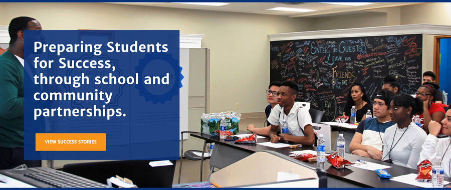
Learn more about the work we’ve done for Liberty Partnerships Program, featured above, here.
2. Unified Story
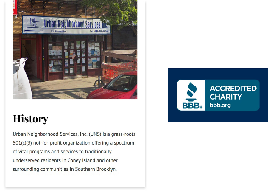
The story of your nonprofit should be well-crafted and unified. Visitors expect to find it easily, and they also expect it to be reinforced by the tone of your written content, as well as images, video and supporting graphics throughout your website. Transparency is also key. Visitors want to see the faces of your organization, where funds are going, and most importantly, the positive influences you are making. If you have a rating from a third-party that you can showcase, this serves as a trust indicator.
See the Urban Neighborhood Services website we recently launched, featured above, here.
3. Frictionless donation process
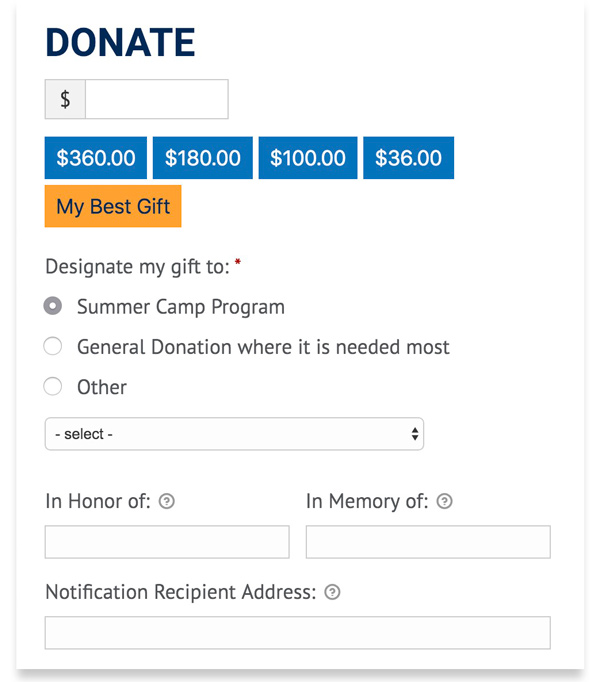
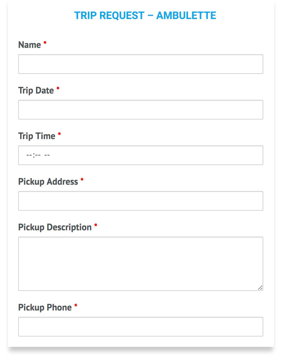
Donating should be easy, and this extends beyond just having a prominent “Donate” button. The donation experience needs to be frictionless, and a lot of this comes down to the way the form is designed. Believe it or not, the size of input fields, labeling, and placement greatly affects engagement. For example, if a user forgot to fill in the CVV field, the error message should display directly below that field, and as soon as they’ve skipped over it. This makes it easier for them to correct. Simple, well-designed forms are less likely to be abandoned, and can lead to increased giving.
4. Human-centered design
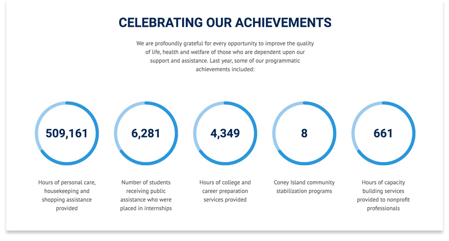
Human-centered design (HCD) is all about meeting the needs of your users. In the nonprofit world, this is an especially important approach, because your audience will have unique needs compared to most website users. They may even have an emotional investment or personal connection to your cause. Human-centered design takes emotion into account. Visitors need to be presented with a message (including visuals) that suggests a role for them to get involved, and focuses on the positive influence they can make.
Learn more about the work we did for the Jewish Community Council of Greater Coney Island, featured above, here.
5. Easy to manage
Nonprofits are often stretched for resources, so it goes without saying that making the website easy to manage should be a priority. The website should also have a secondary objective of reducing staff workload. For example, if visitors can find what they’re looking or easily, there will be less phone calls. If paper forms can be converted to digital, this reduces time spent sorting through paperwork.
Next week we’ll be sharing the must-haves for a successful website in the industrial and manufacturing realm, so stay tuned!
Your inbox needs more Idea Kraft.
