How Idea Kraft unified and strengthened SUNY Cortland’s brand
How often do your marketing efforts focus on your picturesque campus, variety of student organizations and distinguished faculty?
While these may be bona fide selling points of your institution, your competitors are highlighting the exact same features. You don’t need smarter, better or snappier means of communicating those bona fides to stand out, you need to develop messaging that distinguishes you from similar institutions. To do so, you need a strong brand.
Your brand is not your reputation or image; it is a platform that guides all institutional messaging. It ties together your website, digital marketing, admissions viewbook, etc. It turns your entire marketing into a consistent effort that communicates the same message, amplifying its effectiveness. Your brand should communicate the unique value you offer your stakeholders, whether they be prospective students, donors or alumni, and your commitment to providing that value each and every day.
Strong branding drives your institution forward by helping you move your target audience toward desired actions. For example, strong branding can influence the quantity, quality and diversity of your admissions applications. It can attract talented faculty and staff. It can engage your alumni network and impact donor gift size and frequency.
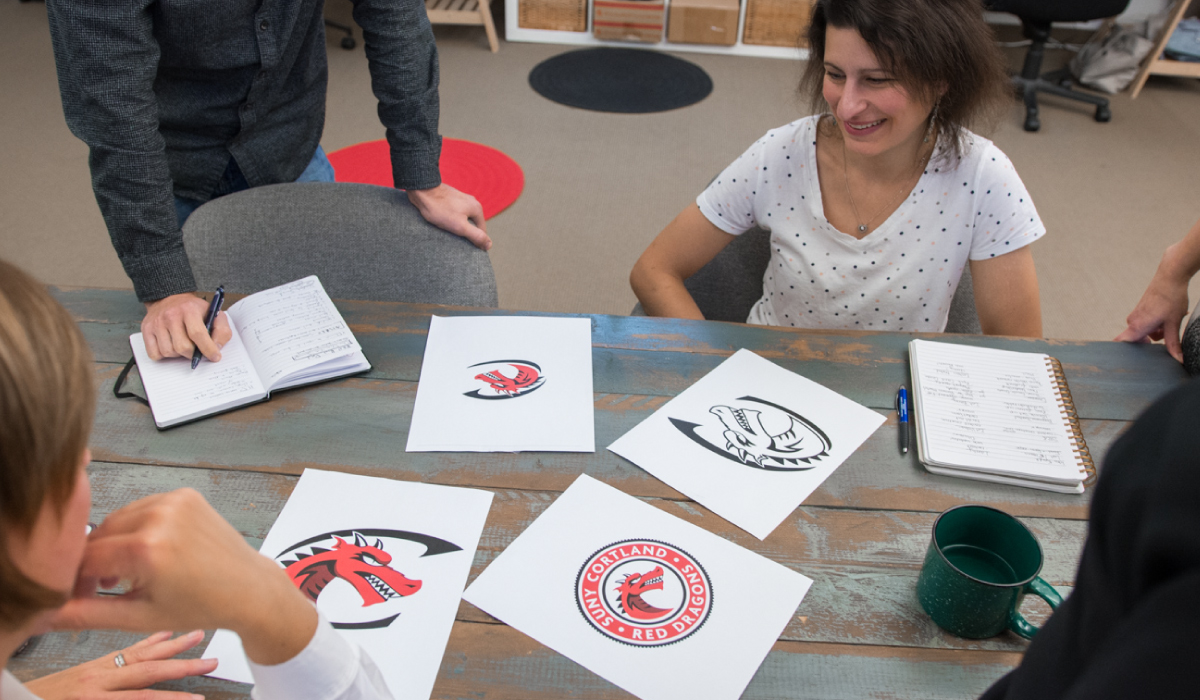
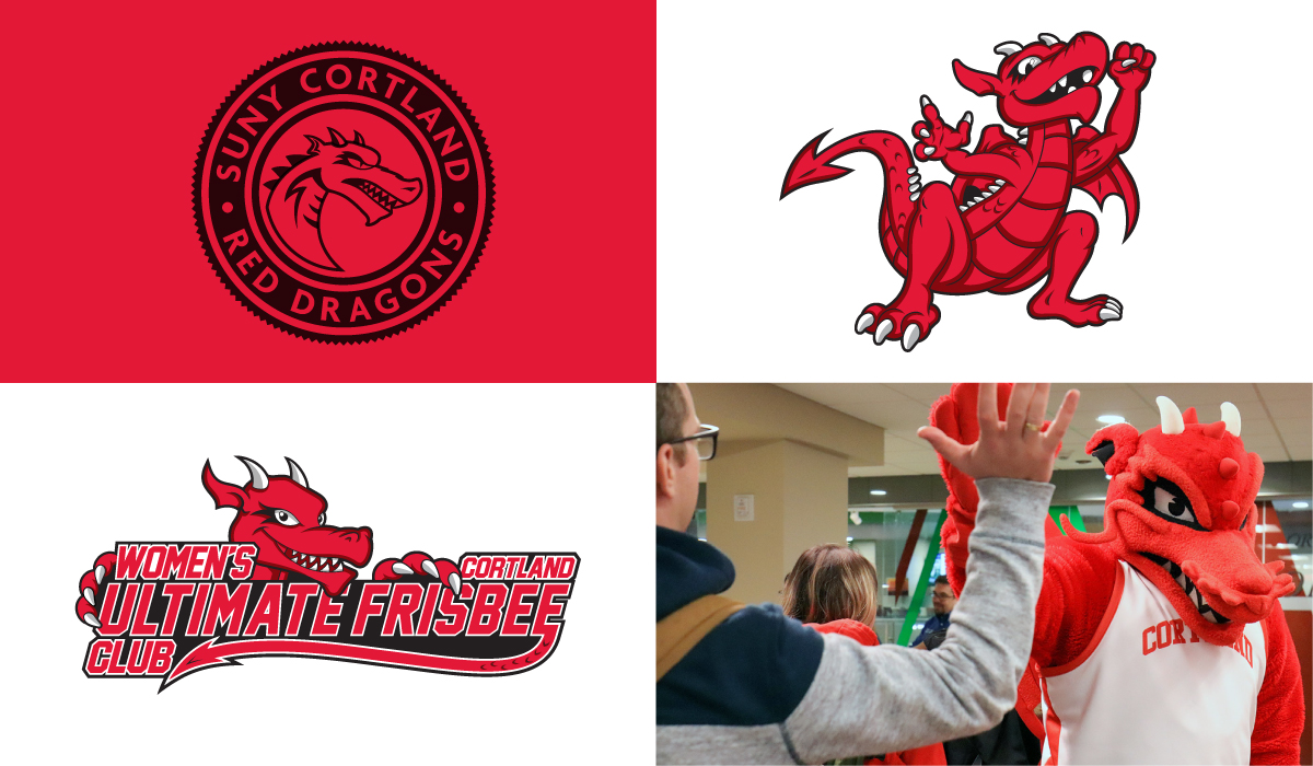
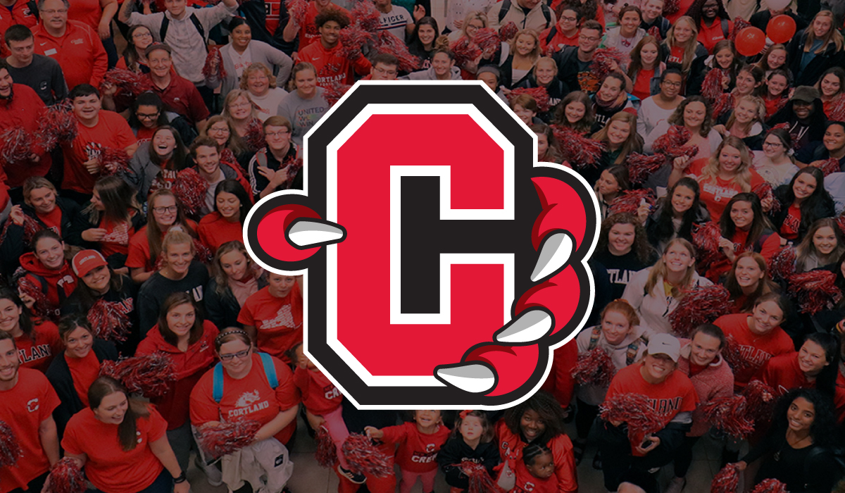
In the case of SUNY Cortland, the college had three primary identifiers: an academic “C” logo, a Red Dragon athletics logo, and a College seal. Due to rules and regulations, few groups could use the athletics marks, and while Cortland’s mascot, the Red Dragon, has historically been associated with athletic prowess, today the champion spirit of the Red Dragon permeates all aspects of campus life, from classrooms to theater productions to student social life. When unable to use the athletics logo, faculty, staff and students created their own dragon graphics, and over the years, several dragons had cropped up across campus. These graphics were inconsistent, with no unifying qualities.
SUNY Cortland needed a Red Dragon that could be used by students, faculty and staff to promote their events, clubs and fundraisers, and that could serve as the cornerstone of the college’s entire communication efforts. Idea Kraft pulled elements from both the athletics logo and the academics logo to create secondary logo marks and Red Dragon illustrations that bridged the gap between athletics and academics. The updated branding communicates that everyone on campus is a Red Dragon, and along with the three primary identifiers, creates a consistent and uniform graphic identity.
LEARN MORE
Email us today to discuss your next branding project!
Your inbox needs more Idea Kraft.
Fresh tips and expert advice, delivered to your inbox monthly.
More Fresh Stories