“Every interaction, in any form, is branding.” Seth Godin
At Idea Kraft, one of the most repeated mantras we have when kicking off a branding project is that a logo is not the only element of branding. While the words “brand” and “logo” are often used interchangeably, a logo is just a piece of the brand. It may be the most forward-facing piece, but it works in unison with many other elements to create a brand in its entirety. If all the elements are not considered, you may end up with a weak brand that takes away from your brand experience. If your overall brand is disjointed, you won’t resonate with the audience that you’re trying to reach.
In this series, we will take a look at all the elements that build a brand: Color, Photography, Typography, Illustrations, Tagline, Voice, and Culture & Values. These elements should be used together in a cohesive and thoughtful way that not only solidifies your brand but elevates it.
For more information and an interactive guide on how to create your brand from the ground up, email us for a copy of our Build Your Brand guidelines.
COLOR
The beauty of color is that it can be used in many ways that are eye-catching and memorable. This can be either as a standalone element or in a palette with complementary colors. Color can be used as part of the logo or even secondarily on items such as business cards, website, or signage.
Colors have a profound effect on our emotions which vary from person to person based on personal experience, culture, gender, etc. It is vitally important to choose colors for your brand that are coming from a well-informed place based on your brand personality and represent you in the correct light. Once these colors have been defined, the world is your oyster!
In honor of inspirational design, we’ve rounded up some of our favorite real-life examples of color use in identity design that are bold, memorable, or inspiring.
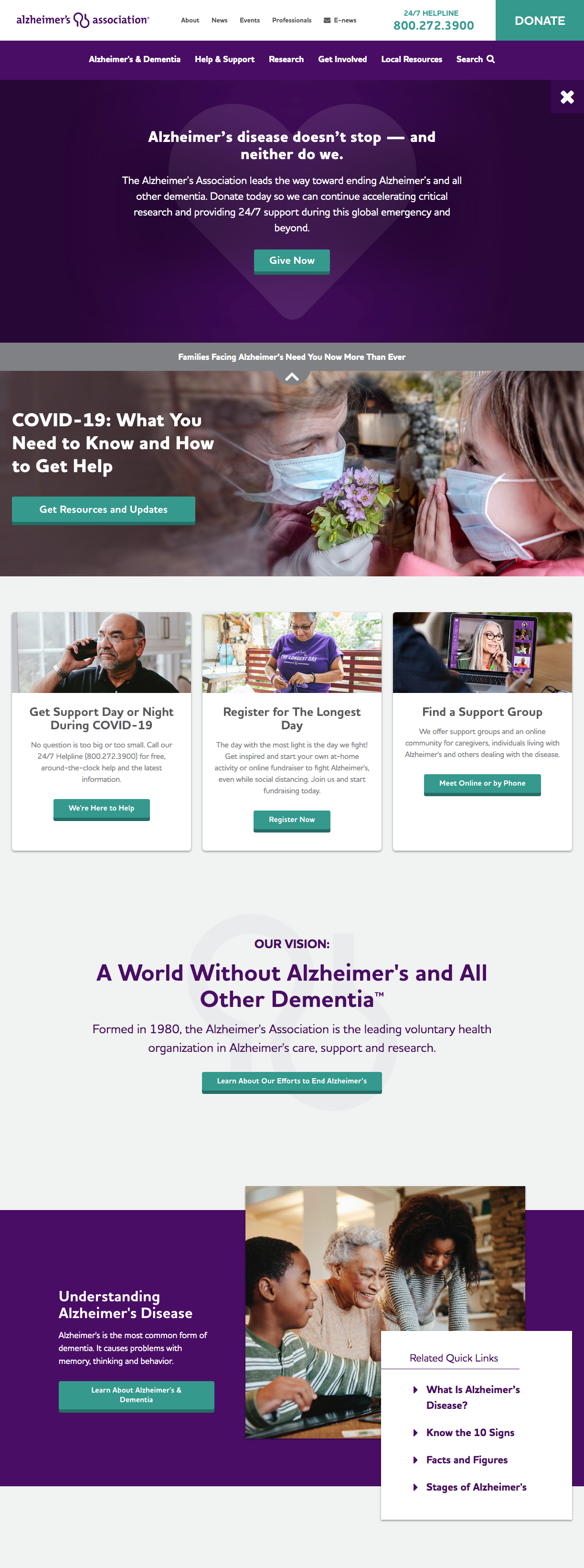
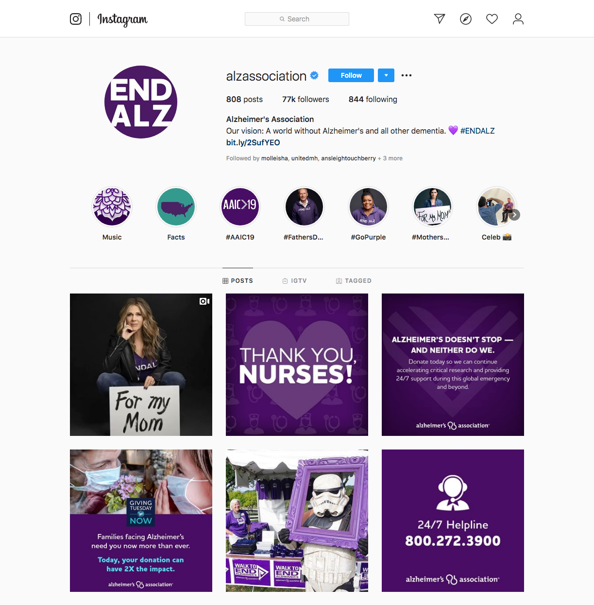
1 – Alzheimer’s Association
In the world of nonprofits, standing out is key. Having a strong brand identity not only lets you stand out from your competitors but reinforces professionalism and trustworthiness. Alzheimer’s Association has successfully used the color royal purple to create a bold and memorable presence worth of their organization’s mission. The color is used across all platforms, from the web, to social to collateral and swag. To accent the color purple, teal is used for call to actions that enhance user experience and draw the eye around the page.

2 – Petbarn
If you’re looking for unique and whimsical design inspiration, this one is for you! In addition to the adorably animated animals, the use of color is bold, eye-catching, and memorable. By keeping the logo black, maximum contrast and impact are achieved with large swatches of yellow. This simple approach to color really makes Petbarn stand out.


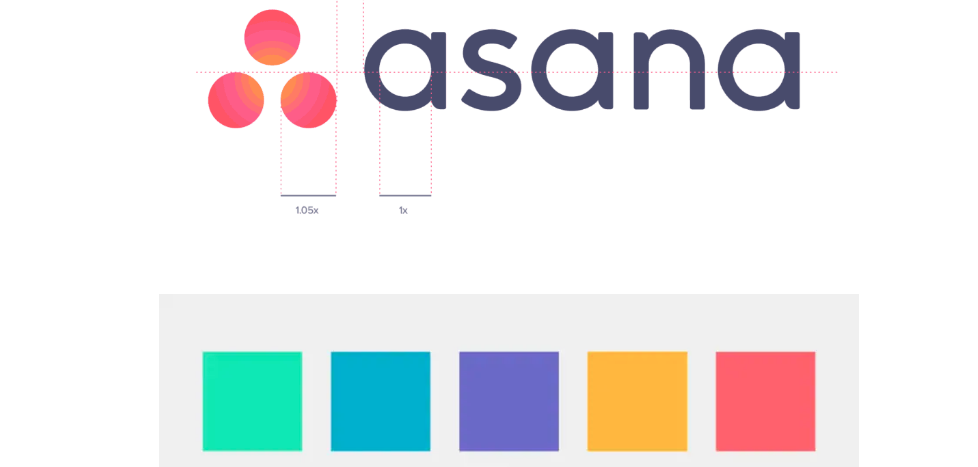
3 – Asana
Colors don’t have to be limited to a single color to be impactful. Asana’s rebranding makes great use of a vibrant and cheerful color palette that is used throughout their branding to create a uniform and cohesive system. As Product Designer, Micah Diagle, from Asana stated, “in an ocean of bland, blue-tinted enterprise software, we saw ourselves as a magical, multicolored narwhal.” These playful colors extend from the logo to their website, to the app and illustrations.

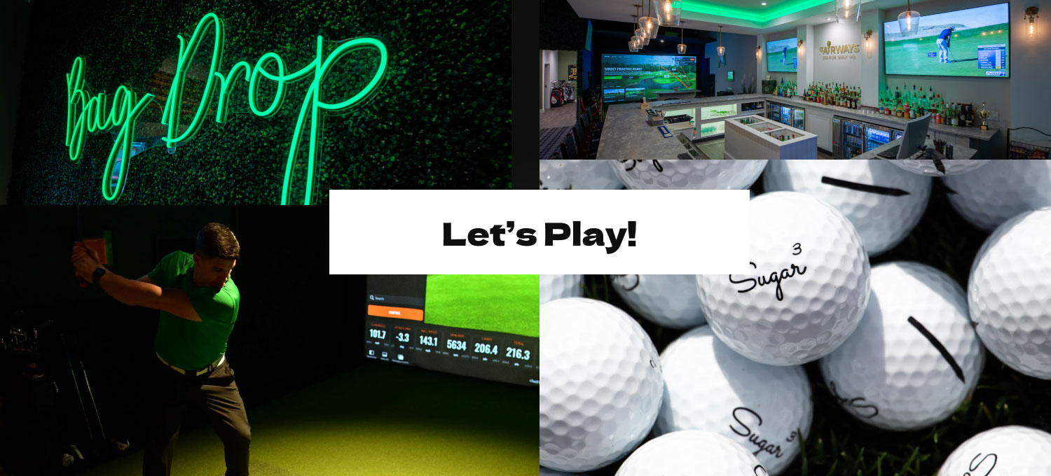
4 – Uselab
In single color executions, color can have maximum impact when paired with other branding elements such as photography. Uselab makes the most out of its signature green by contrasting the bright friendly color against black and white photography. Sticking to this formula throughout their identity allows for cohesion and a strong visual identity.
![]()

5 – Lyft
Color can have a huge impact on differentiating your brand from your competitors. From a visual standpoint, Lyft’s hot pink color palette offers a stark contrast to the more muted colors of Uber. The hot pink is carried throughout the logo, social presence, and advertising.


LEARN MORE
Email us today to discuss your branding project or to get more information on how to build your brand!
Your inbox needs more Idea Kraft.