6 Ways to Elevate Your Architecture Firm’s Website
It might go without saying that every architecture firm needs a visuals-forward website. What might not be so clear is how to create a website that’s both true to your firm’s style and compelling to potential clients.
But there are a few web design tips that can help elevate any architecture firm’s website – in terms of both design-centered aesthetics and user experience. The Idea Kraft web team is using our experience to weigh in on the 6 things every architecture firm website should have to stand out:
1. High-End Photography
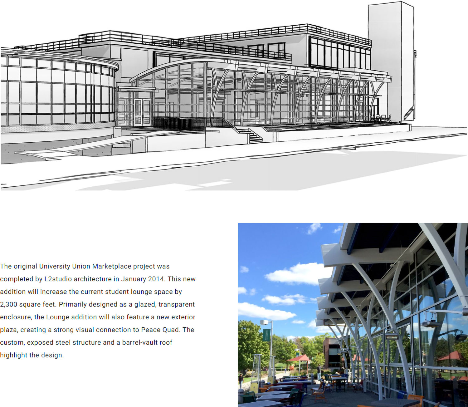
The importance of photography can’t be overstated. Completed projects need to be captured with high-end photography that showcases the work in a dynamic way that tells a story through angles, composition, and close detail shots.
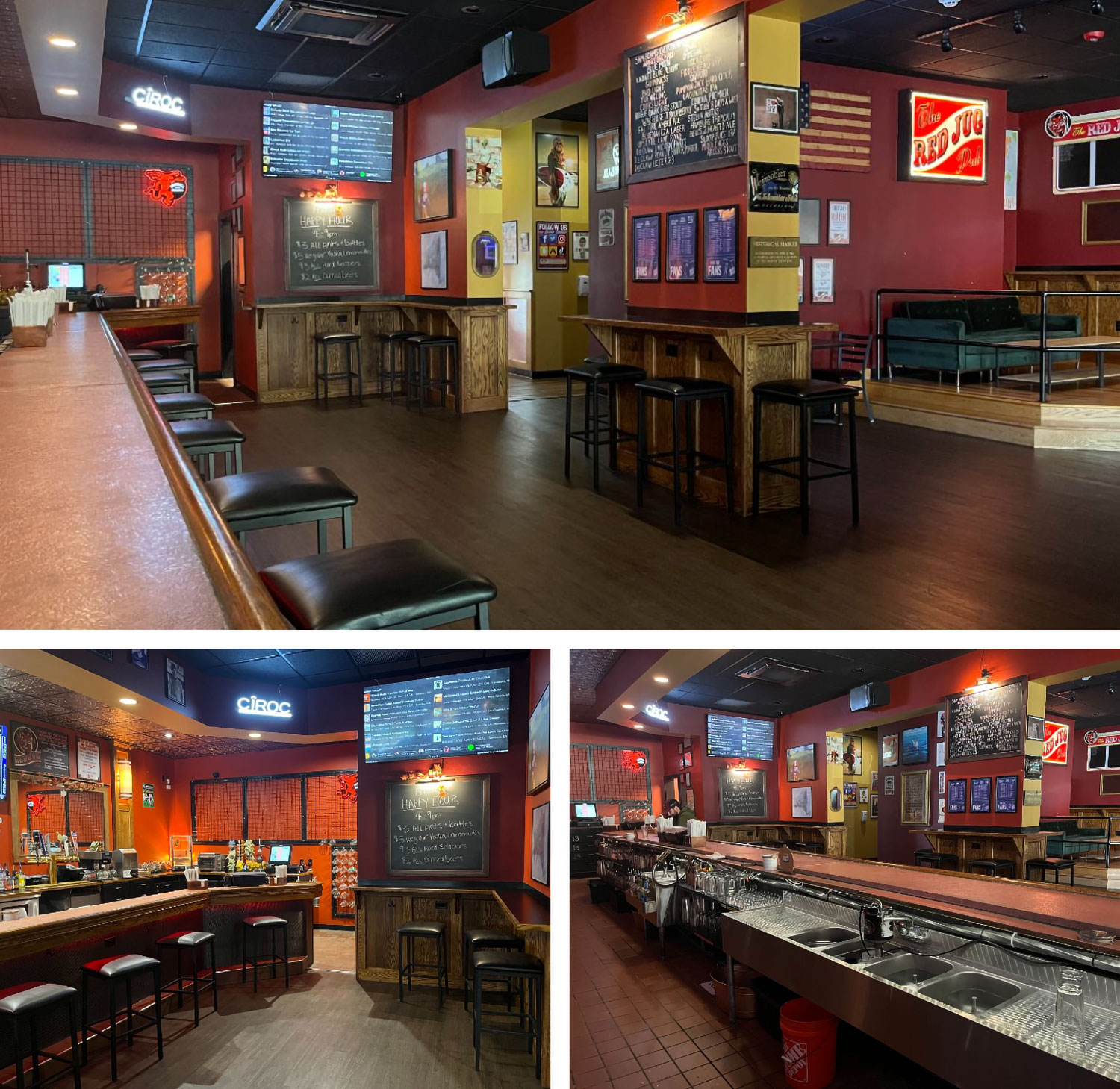
When the architecture firm L2studio came to Idea Kraft for a new website, they already had stunning photography ready for our use. We cropped their library of photos into standardized image aspect ratios in order to pave the way for more polished, structured, and intentional page layouts. See how we arranged photos of L2studio’s architectural work on their portfolio page for the Red Jug Pub below.

2. Easy-To-Understand Copy
It might be tempting to use architectural jargon as a sign of your expertise. But copy written for architects isn’t going to interest your clients, who are probably not architects themselves.
Consider adding quick definitions of technical terms or substituting them for simpler ones. Remember: making copy easier for laypeople to understand doesn’t mean “dumbing” anything down. Helping people understand technical language with explanations or context is smart writing, and it instills a sense of trust in the reader.
3. Thoughtful Page Layout & Structure
Your website is a digital space. We highly recommend working with a web design and development agency to make it a comfortable but exciting place for clients. An agency can also help you translate your style of architecture into page designs, whether it be refined and classic or edgy and bold.
If the examples you see online don’t inspire you, take inspiration from the mediums that do. L2studio wanted their project pages to resemble a magazine, with copy interspersed throughout. So we created building blocks of text and photos we could mix and match to customize each page.

4. Plenty of Whitespace
Whitespace is a powerful tool. For architecture firms especially, whitespace allows users to see multiple photos of one property as a whole.
Whitespace is just as important for all other elements on a page. Text that might otherwise be skimmed has a chance to stand out if it isn’t competing with photography. Buttons and UX copy will be easier to notice if they have more breathing room, too.
5. A Subtle Color Palette
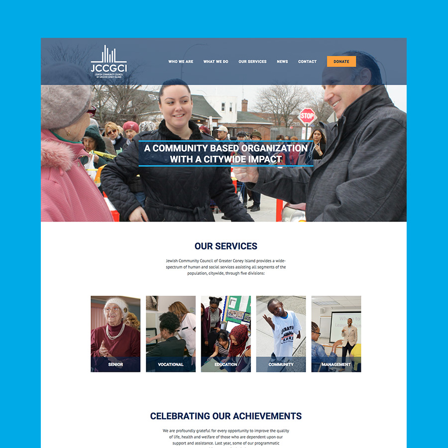
Photography should be the main focus of an architecture firm’s website. You don’t want to overpower it in any way. Keep attention on photography by avoiding strong colors (and too much color in general).
Where color is needed, use a grayscale or neutral color palette. Bright colors or pops of accent color should be used sparingly – or meaningfully. For L2studio, we incorporated gray accents and pops of orange, which are their brand colors and helped keep consistency.
6. Well-Displayed Services
We’re all for creative design, especially in a field like architecture. But creative liberties should only make it easier to find your services, not harder.
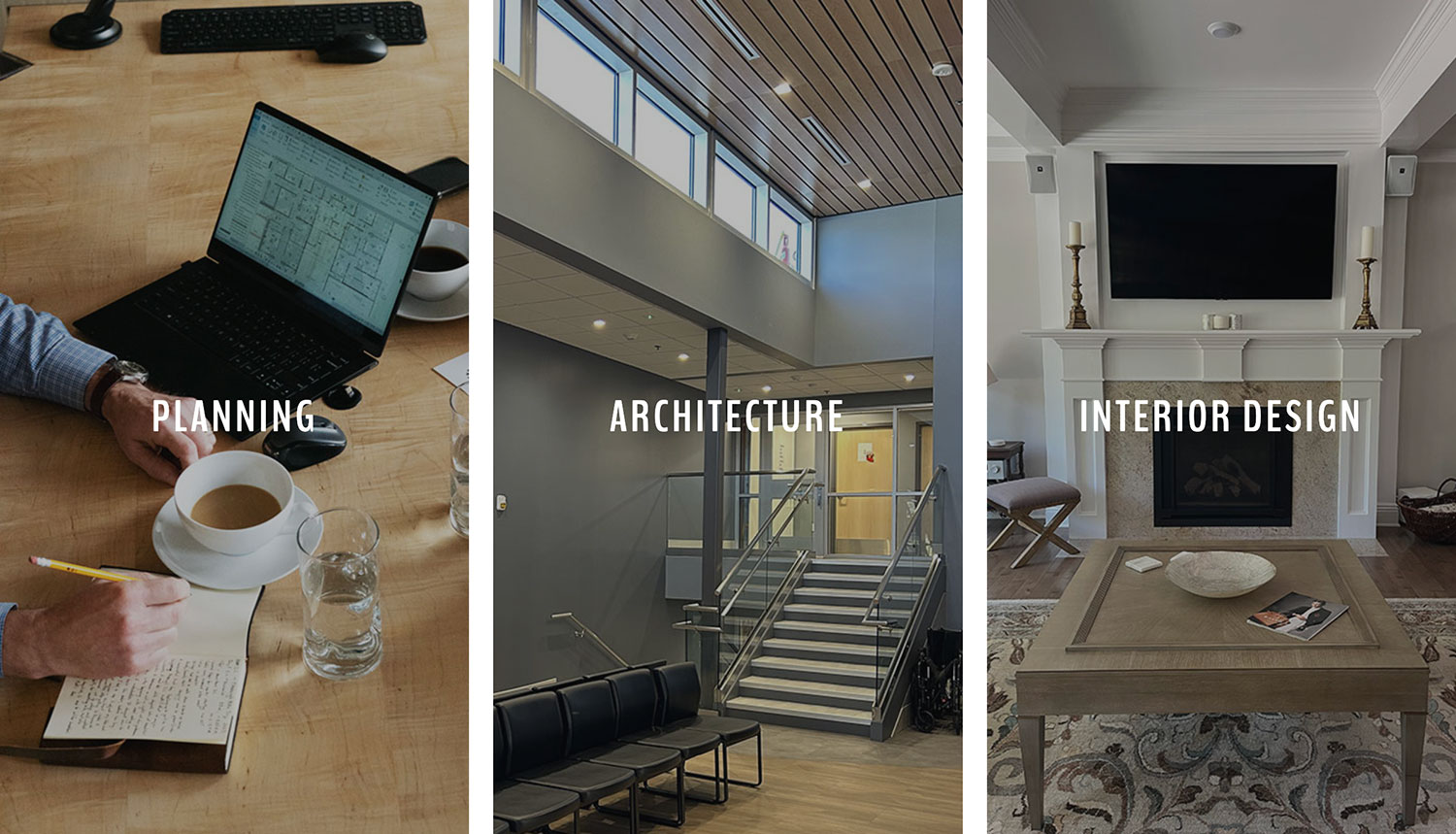
Make sure you have a page for each service your firm offers. Service pages should clearly state differentiating points and what potential clients can expect from working with you. Bonus points for including visual examples of completed projects.

We’re ready to partner with you.
Idea Kraft’s branding, messaging, web design, and web development services help architecture firms across New York State and beyond stand out from the competition. Ready to start building a better website for your architecture firm? Get in touch with our team for a free consultation today.
Your inbox needs more Idea Kraft.


