The Client
Guthrie Community Credit Union
In 2020, Northeastern PA mainstay Guthrie Federal Credit Union became Guthrie Community Credit Union. To coincide with their name change, they needed a rebrand and website equal parts welcoming and expert.
How We Helped
Brand strategy
Brand identity
Brand messaging
Digital experience
Art direction
Copywriting
UX & visual design
A forward-looking rebrand and website that celebrates the past.
The New Brand
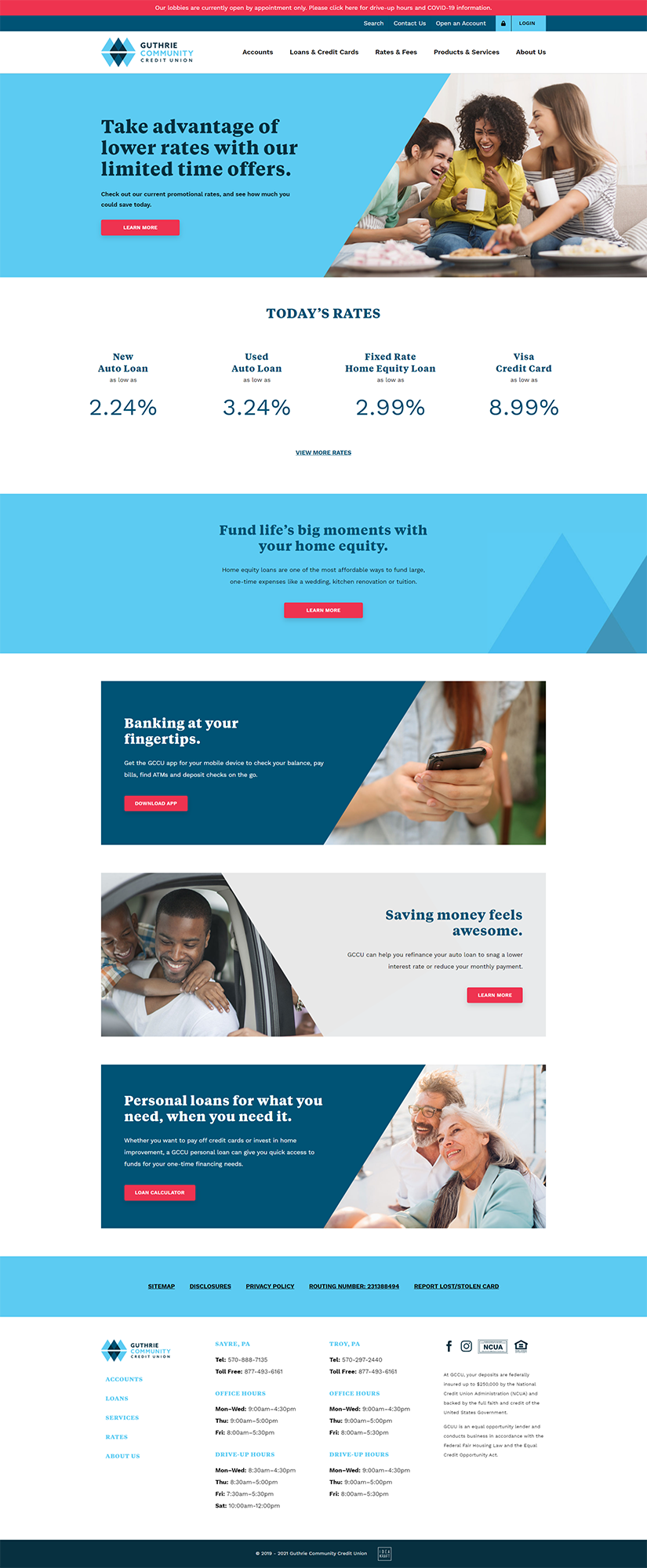
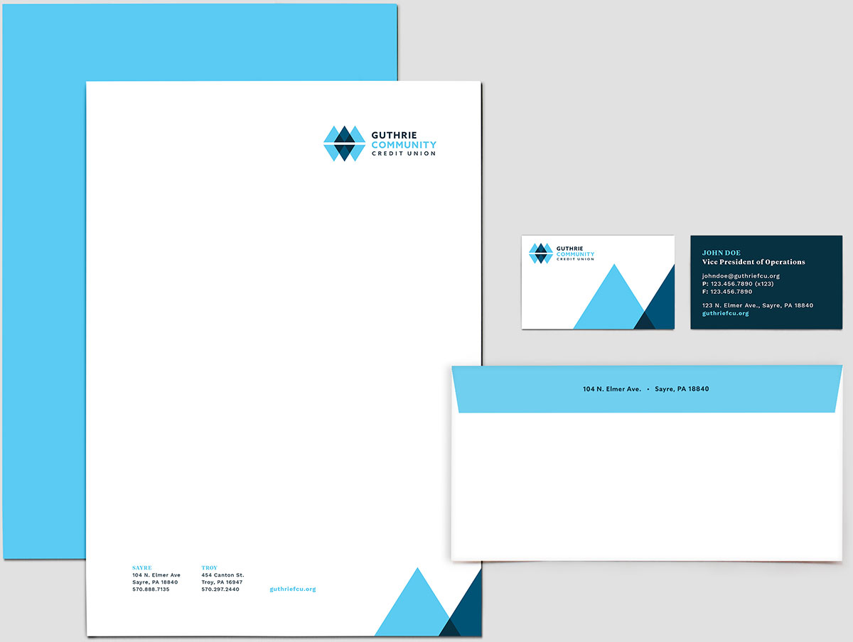
Through a unique visual and verbal language, we developed a community-oriented and welcoming personality that members could trust. Soothing floods of color, diamond patterns that convey strength, consistency and wealth, and approachable messaging that entertains and educates show that GCCU understands and empathizes with its community.

The Logo
The blue hues in the new logo inspire feelings of dependability, trust, and commitment. The fluid and dynamic structure suggests flexibility and partnership. The three diamonds of the logo convey strength, consistency and wealth and nod to the Sayre region’s Black Diamond locomotive history. The logo also doubles as a rough outline of the Penn-York Valley’s landscape: mountain peaks reflecting in the river valley below.

The Typeface
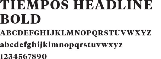
The typefaces used to create the brand are both impactful and tasteful. Tiempos is a modern serif that strikes a delicate balance between practicality and elegance. Work Sans does what the name implies— it’s a workhorse of a typeface that can be used across screen and print with excellent legibility.


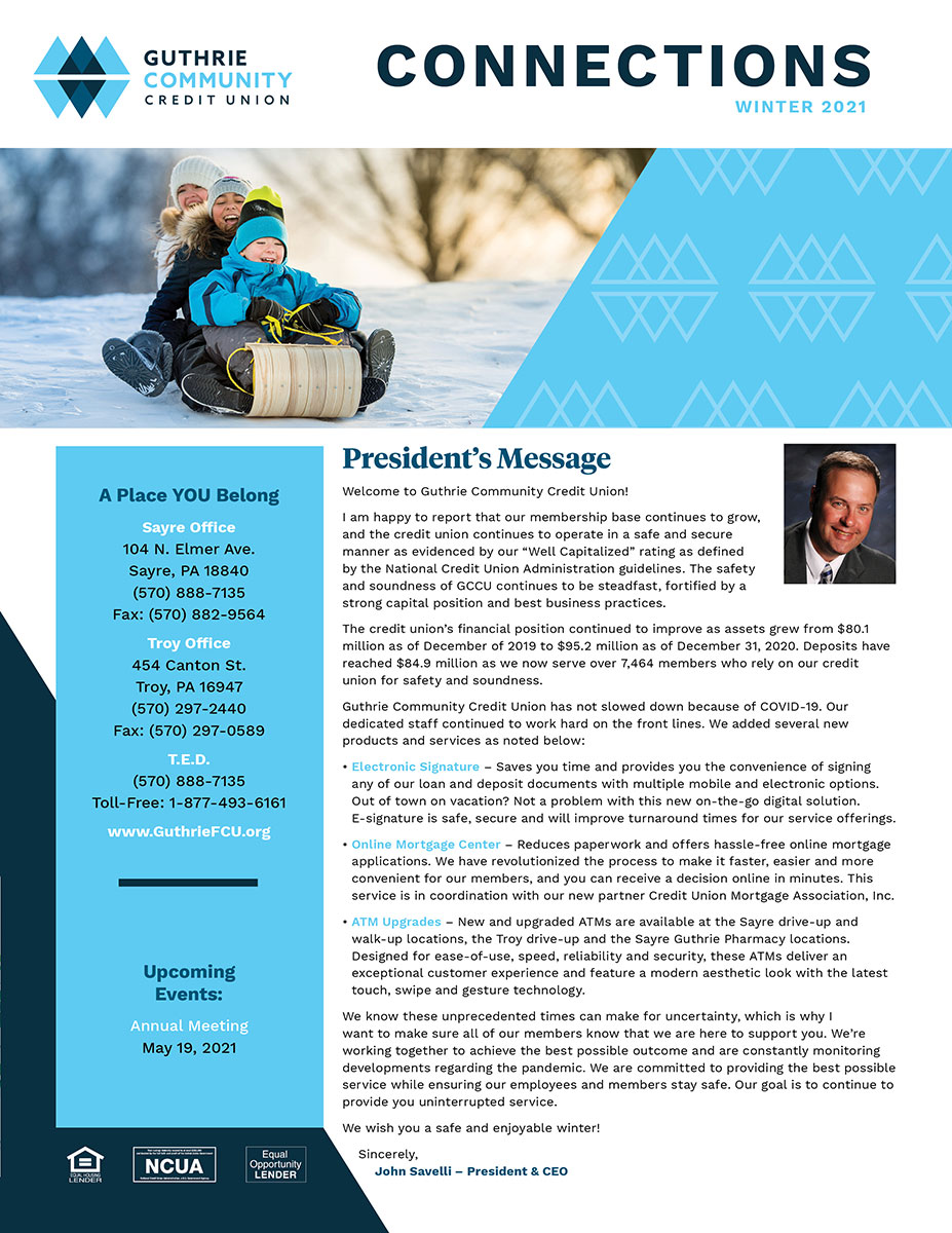
The Messaging
The brand tone of voice needed to communicate the authority of GCCU in the financial sphere without sacrificing its friendly and approachable qualities. We crafted bold, straightforward language that builds trust in the GCCU brand and products, rises above the crowded financial space and connects with members on a deeper level.
The Website
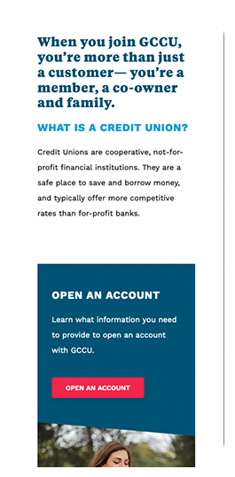
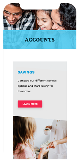
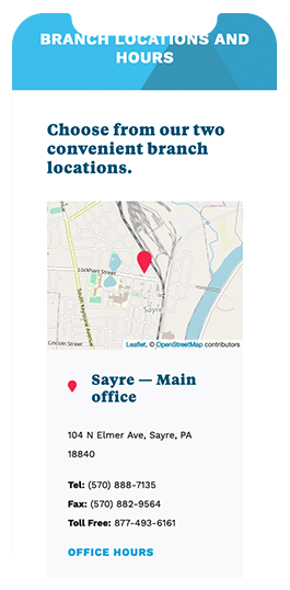
The GCCU site underwent a complete overhaul from backend to frontend. We started by upgrading the outdated and limited-functionality CMS with a versatile framework that is user-friendly and easy to update. We then re-imagined user journeys by introducing a mega menu that declutters navigation and allows users to seamlessly browse Guthrie’s products and services. The site brings the welcoming and bold brand system to life by iterating brand elements that fit the specific needs of the web. The visual design emphasizes the trustworthiness and community-oriented mission of the credit union while using the brand’s type and color options to create a bold aesthetic and establish a clear visual hierarchy.
