The Client
Jewish Community Council of Greater Coney Island
The Challenge
The biggest challenge of rebranding the Jewish Community Council was making sure that the approach was broad enough to appeal to all the audiences that used the JCCGCI’s services. The client wanted the focus to be taken away from the “Jewish” part of their name and put on the community and citywide audience that they actually cater to.
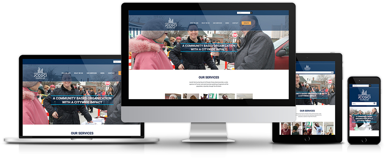
This citywide approach was then applied to the website redesign, with a focus on the many offerings the JCCGCI offered to a multitude of people.
Before


The Solution
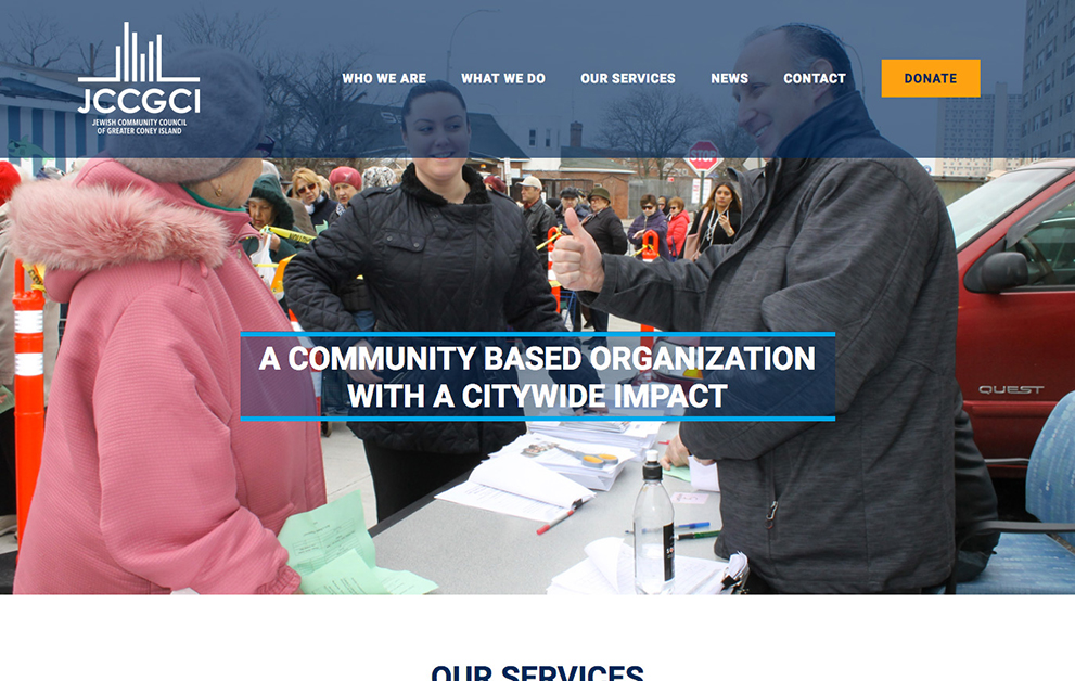
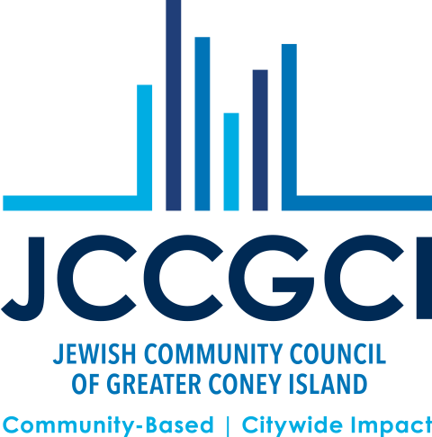
JCCGCI’s tagline, “A community-based organization with a citywide impact,” served as the backbone for our design. The new logo visualizes their citywide scope through the NYC skyline, and even appears as a design motif throughout the site. Scrapping their uninviting red color scheme, we implemented a bolder and more modern blue palette that felt serious, but friendly.
We took the focus away from their full name and use the initialism (JCCGCI) as a point of reference in both the logo and the copy.
While the site was difficult for staff to manage, it also discouraged JCCGCI’s target audience: those in need, and donors. Competing menus scrambled content, and donors had to take cumbersome off-site steps to complete transactions. Site visitors looking for help, such as the elderly and those without English fluency, could feel overwhelmed navigating the duplicate and sometimes inaccurate information.
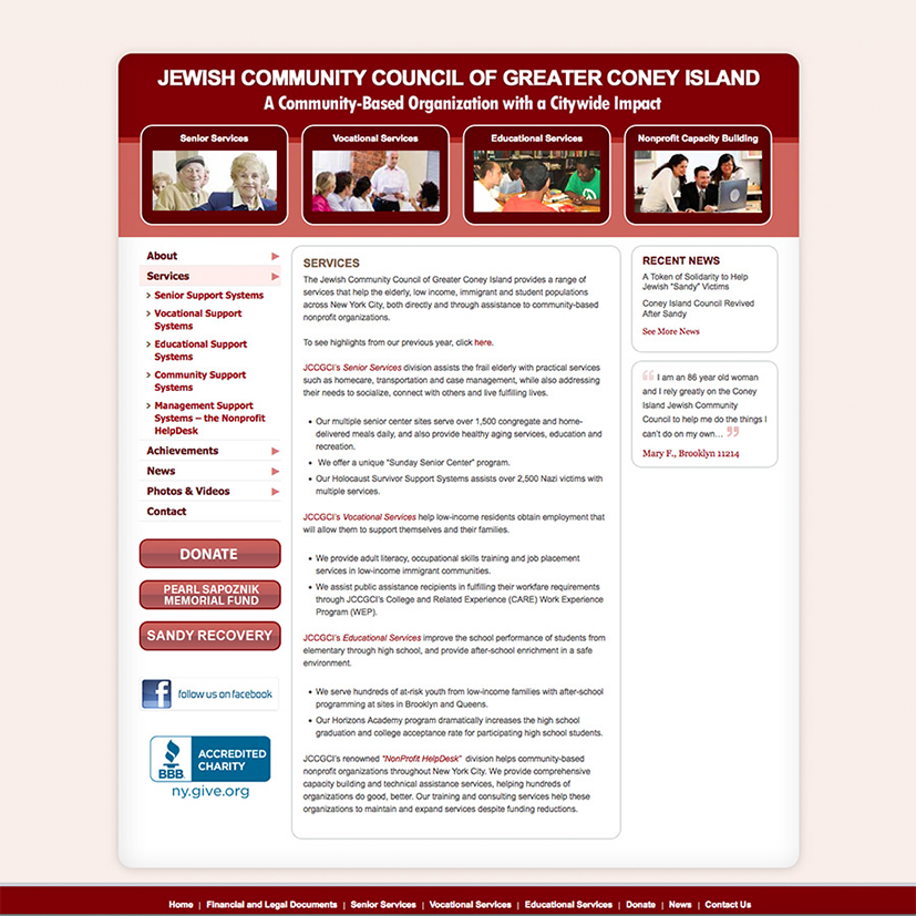
Modifying the layout and the copy was a simultaneous process. Because every service page was completely rewritten, our content and web team needed to work on the sitemap together to streamline this new content. The homepage now guides visitors through their latest achievements, showcases up-to-date photos and encourages donation with a clear hierarchy.

