The Client
Liberty Partnerships Program
The Challenge
As 2019 marked their 30th year, it was time to reflect upon their brand and create new elements that truly represented the organization and would carry them into their next thirty years. Just as LPP helps students to reach their full potential, it was Idea Kraft’s turn to help LPP reach theirs.
“Design creates culture.
Culture shapes values.
Values determine the future.”
Robert L. Peters, designer and author
Before

After
The Solution
We introduced a modified logo refresh that stays true to the original symbology. We kept the torch icon, but reworked it to feel more modern, bold, and impactful by simplifying it and bringing it to the forefront of the logo. The previous logo had typography that got lost in the design, and we wanted to put more focus on the name.
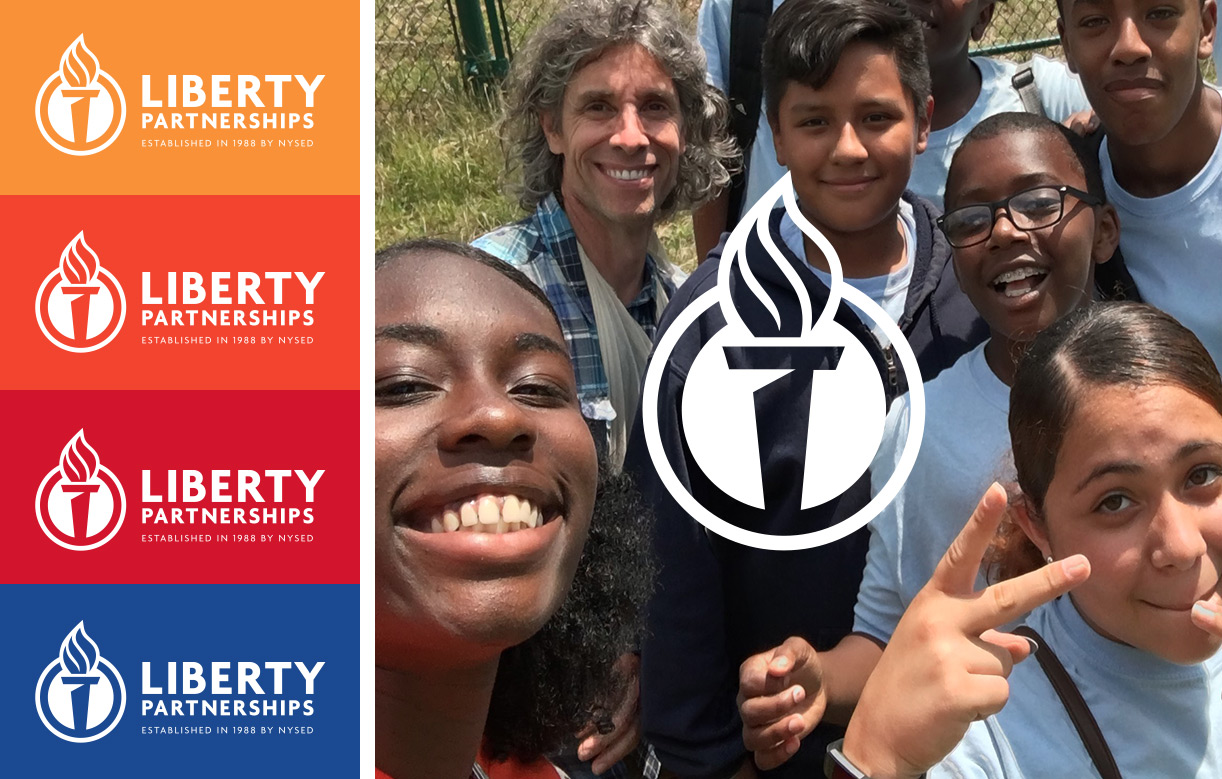
The logo was also created with reproduction in mind – it is now easily changed to a single color version to be used by all the various organizations where monochromatic merchandise printing is common.
To ensure success in use, we also created a brand guidelines document that will help the multiple users of the logo have a clear pathway to success. Many of the users are unfamiliar with correct logo usage and the different production standards available to them. The guidelines will help inform them how to launch a successful new brand and look their best.
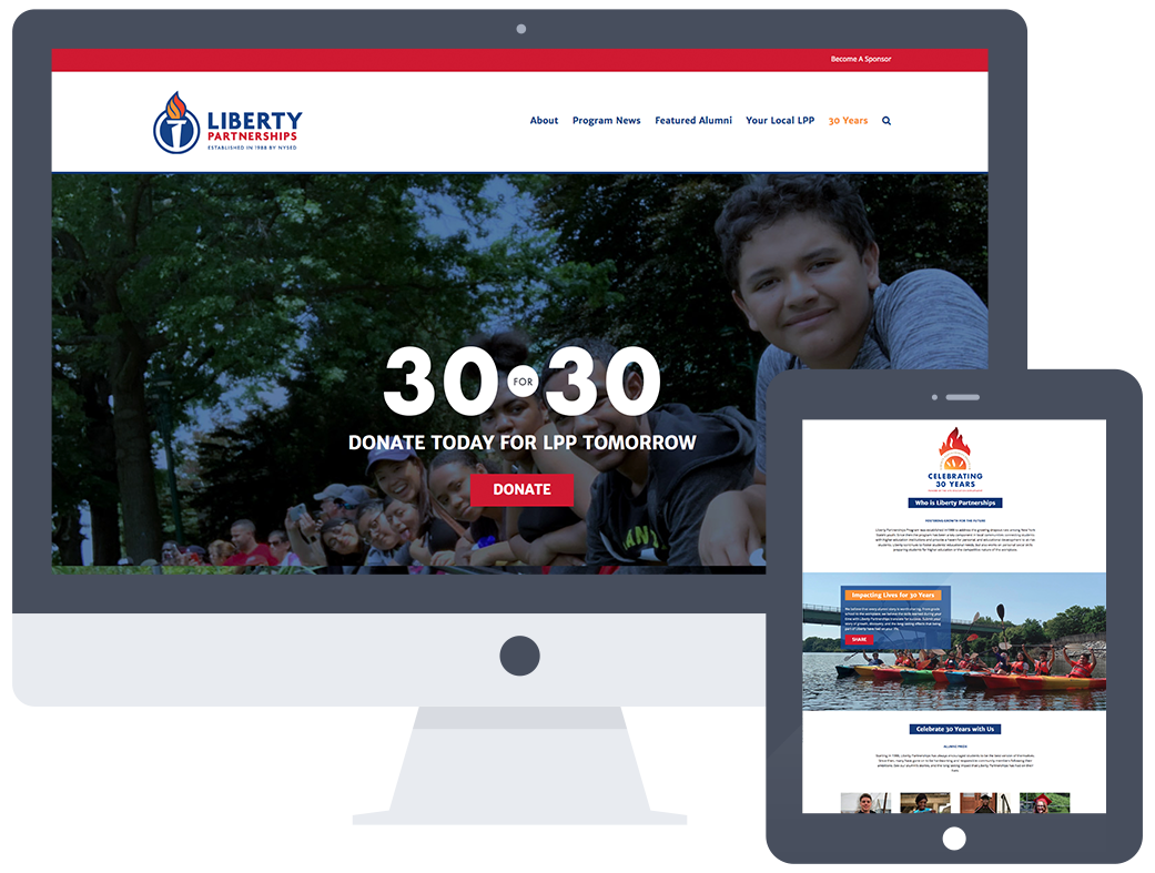
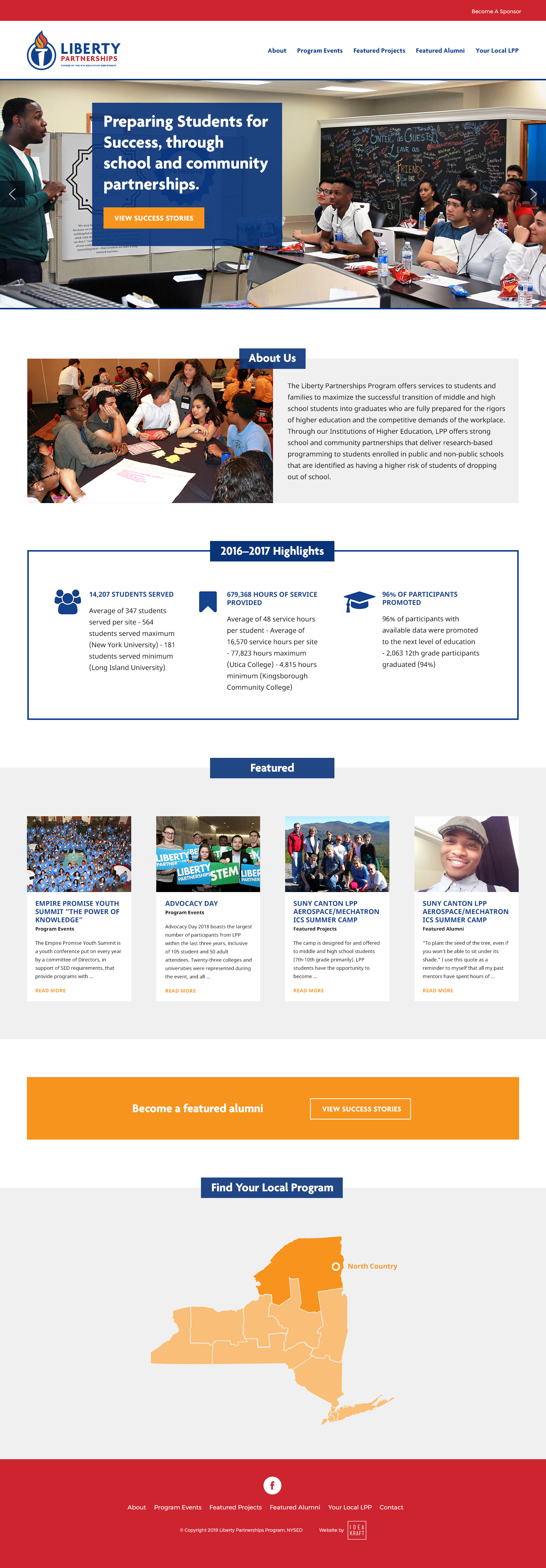
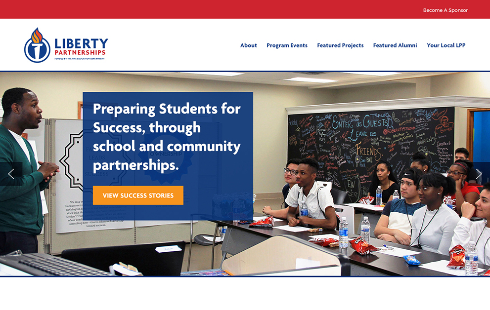
In addition to their main website, we created a subpage that can be used as a landing page to promote and bring awareness to their 30 for 30 campaign. This subpage honors the 30th anniversary of the organization with a focus on donations and highlighting alumni. A special logo was also created for this anniversary to use on promotional materials throughout the year.
