The Client
Green Fork
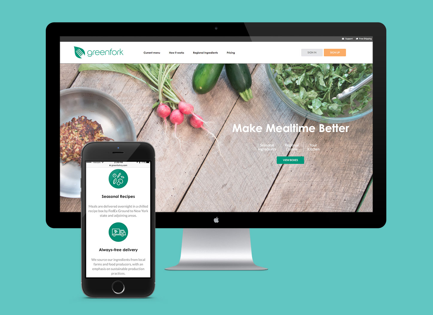
Early Morning Farm has grown into one of the largest and most successful Community Supported Agriculture (CSA) farms in Central New York. Offering close to 50 member pick-up locations in 17 towns, the owners decided to expand their outreach even more. The farm recently decided to enter the growing meal service market by providing boxes of fresh, locally grown foods, along with recipes for quick and easy meals via mail subscriptions.
How We Helped
Visual brand identity
Illustration
Merchandise
Web Design & Development
The Challenge
We began our process by first discussing the vision for the brand, its core mission, and target audiences.
Every now and then a project comes along that doesn’t require a design brief, but we understood right away what we were trying to accomplish. Admittedly, we tried very hard not to spend our entire meeting talking about food.
We started off by creating mood boards—compilations of inspirational images, color palettes and graphics that would lay the groundwork and create the feeling they hoped to emit with the brand’s look and feel.
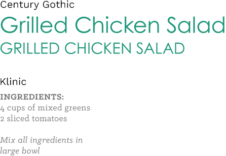
Typography
Color Palette

The Solution
Creating this brand was like creating a new recipe. With the right ingredients of freshness, sweetness, and savory goodness, we explored different shapes and color palettes until we found the right combination.
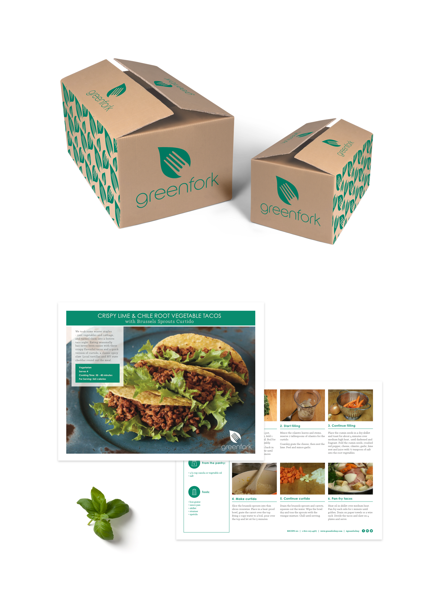
The final logo—a simple, thin typeface matched with a fork-imprinted leaf—was chosen due to its modern imagery, allowing the symbol to grow with the company while always embodying the brand’s core messaging. With the logo and visual theme finalized, we turned the project focus to the product packaging.
As the brand was representing a tangible product rather than a service, we knew that the connection with the consumer would initially be created with the product’s packaging, so we decided to use a green leaf pattern as a subtle complement to environmentally friendly boxes and bags.
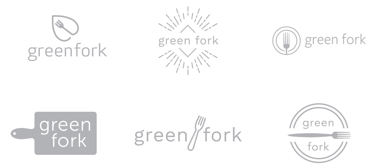
Logo Sketches
