The Client
Greater Binghamton Chamber of Commerce
The Challenge
The Chamber approached Idea Kraft looking for help not only changing their visual identity, but also in the way they were presenting themselves through their core messaging, mission, and values. With a transition of leadership taking place, it was time to look to the future. The Chamber wanted to stand out and create a fresh look to show themselves in a new light.
Throughout the branding process, we looked at several different aspects and asked, “What would members be looking for?” With that in mind, we conducted email surveys and focus groups with members of the Chamber to determine what was lacking, and what was working. Their input and vision was the key for Idea Kraft to rebrand and point the Chamber in the right direction for the future.
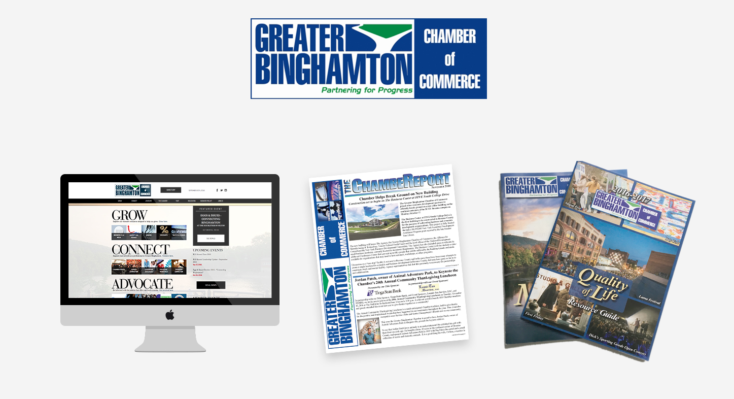
Before
Our Approach
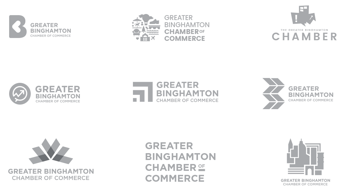
We started the process with mood boards and an exploration of name changes. “The Chamber?” “GBCC?” “Binghamton Chamber?”
Next, we explored single letter representations, as well as iconic Binghamton imagery. We worked collaboratively with the Chamber to explore concepts that represented the values they associated themselves with—growth, business, community, conversation, vibrancy.
After
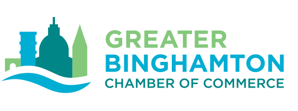
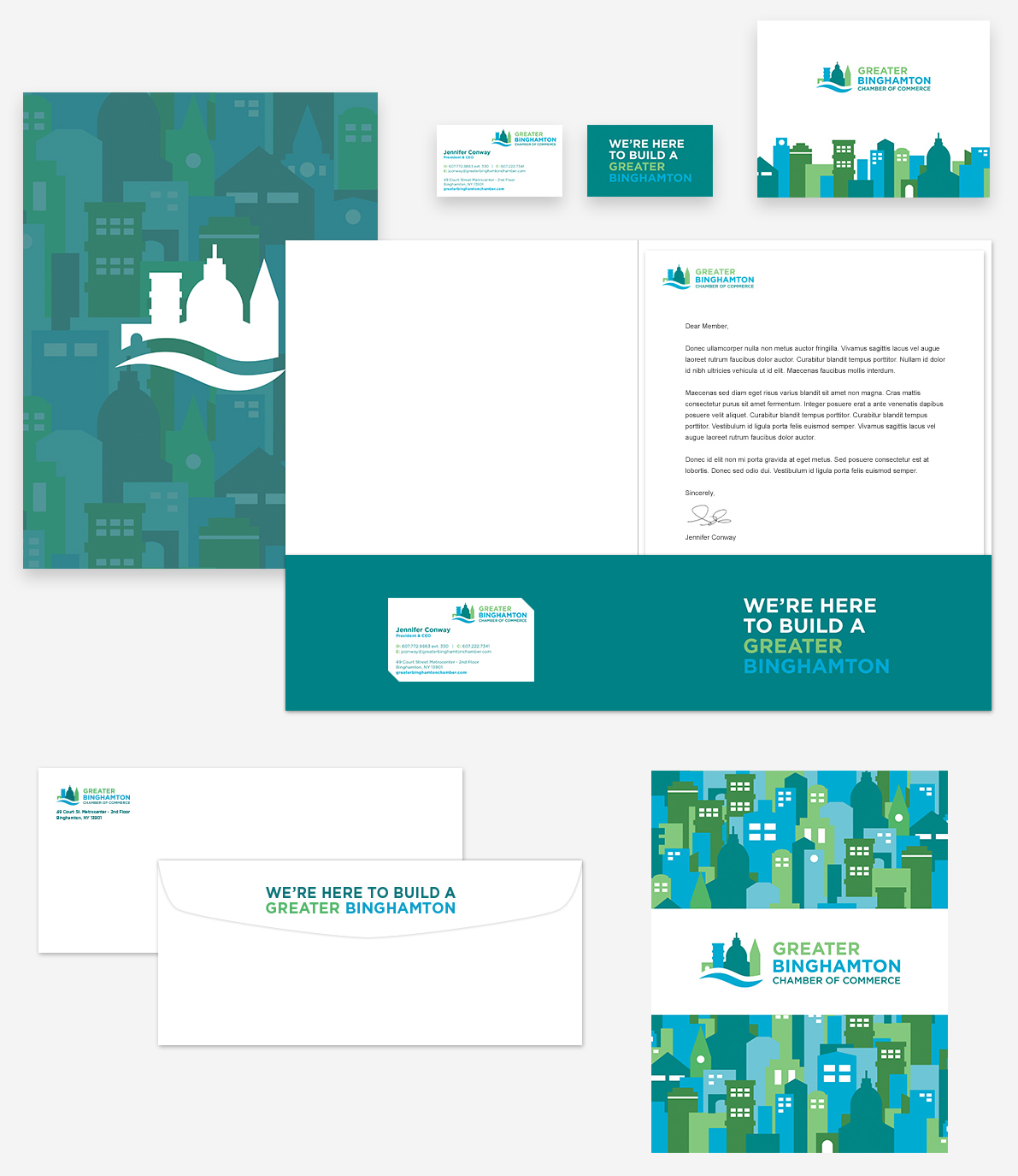
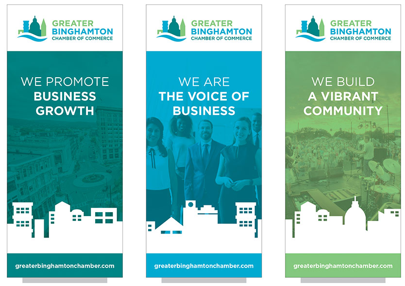
While the former logo concentrated on the confluence of two rivers, the new logo focuses on the business landscape and depicts familiar buildings in the Greater Binghamton area. We refreshed the color palette to make it more vibrant and less corporate, and made both print and web materials more legible, modern, and approachable.
Color Palette

Illustrations
A full library of icons was created to depict key brand values, and services. In addition to the icons, landscapes were created as a secondary visual element to use across platforms to create interest and a bolder, dynamic look.
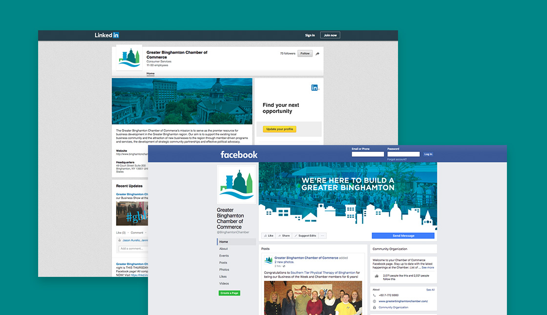
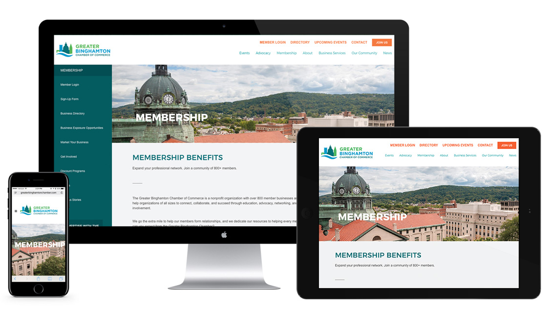
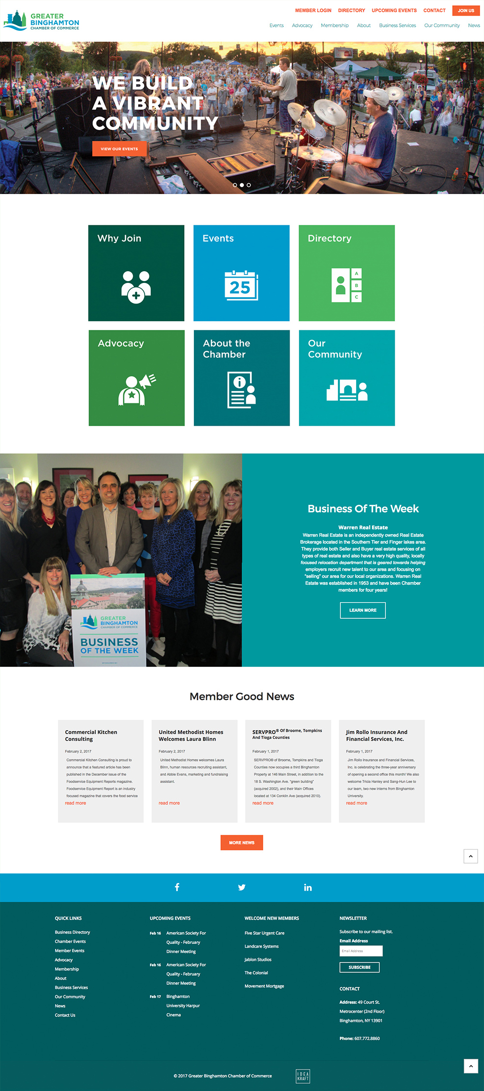
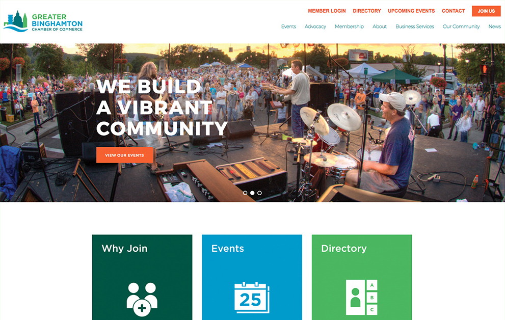
User research revealed frustration with the old website’s navigation and the ability to find information. Content needed to be fresh and constantly changing so viewers would return to the site. Visually, we made the colors more energizing, moved away from stock photography, and put more focus on members and businesses. In addition to the corporate site, we also created an event landing page to promote the official brand launch.
