The Client
Pleasant Valley Wine Company
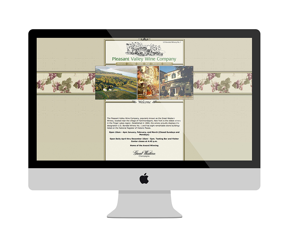
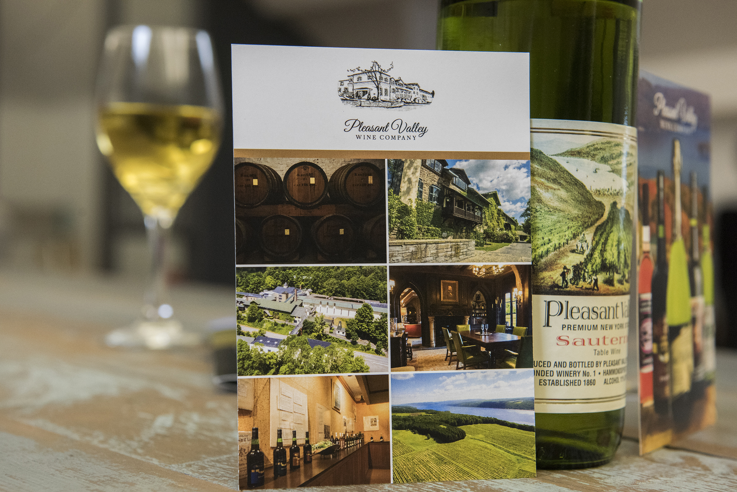
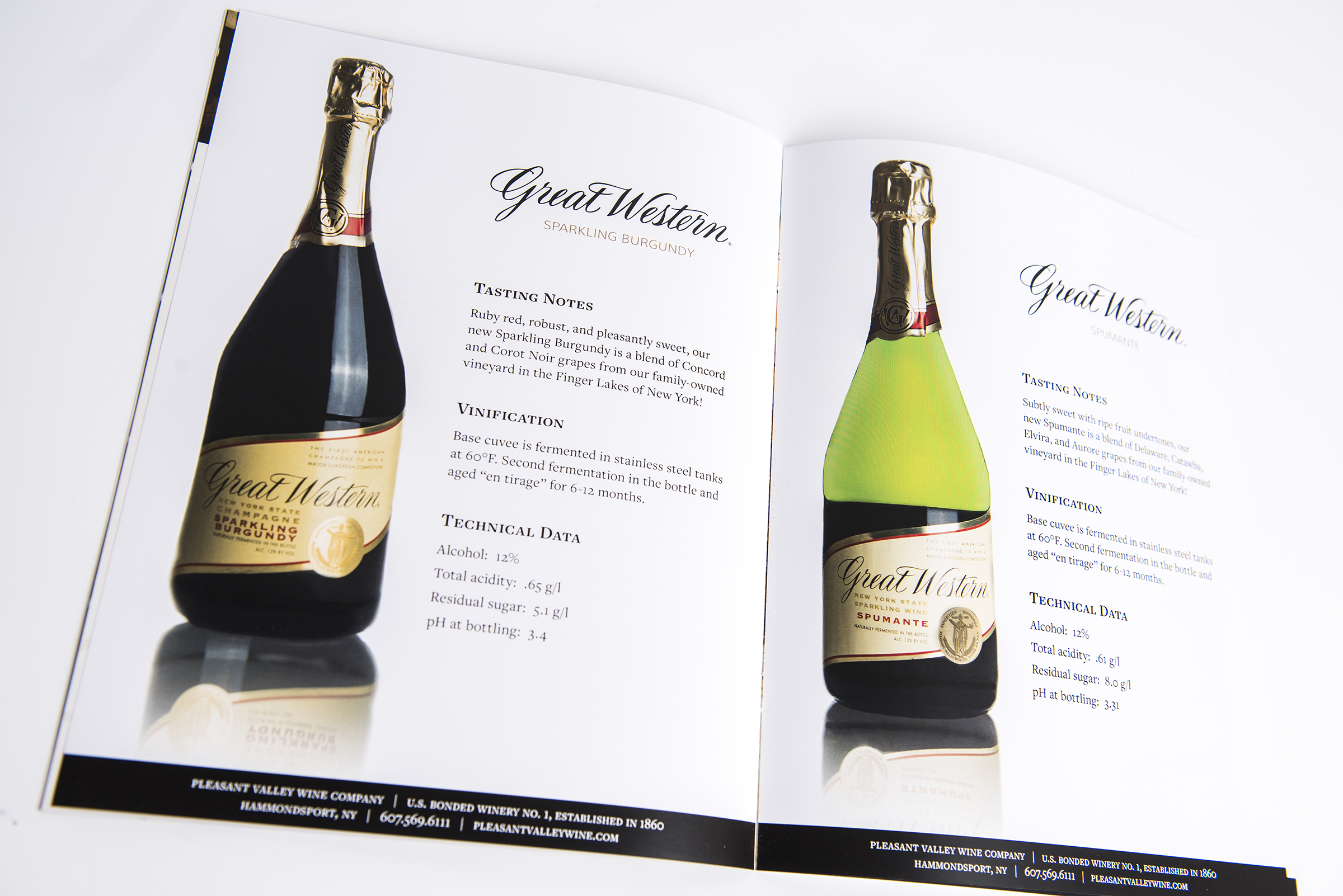
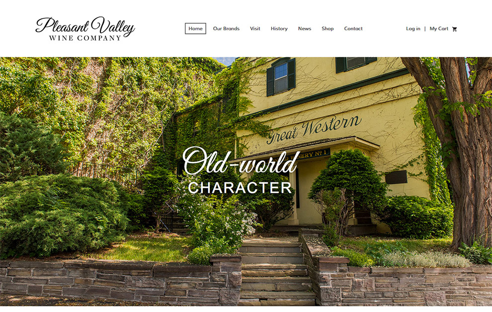
Throughout the years and multiple acquisitions, the overall brand was inconsistent and sparse. Furthermore, it had a very dated online presence. We were very excited when Pleasant Valley approached us to help refresh their brand, especially knowing their amazing history and heritage. Through a truly collaborative effort, we helped them redesign and relaunch their web platform. Specifically, we placed an emphasis on e-commerce and a hybrid blend of user experience and visual design. In addition, we helped to expand the brand by updating their printed materials and packaging.
How We Helped
Branding
Print Design
Web Design
Before

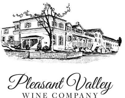
The previous logo had been used inconsistently on materials. The typeface changed with every application, and no consistent guide had been set up. Also, the illustration was hard to see and the tagline got moved around frequently. In order to create a standardized “lockup” we fine-tuned the logo, and set a standard typeface to use. We also created two versions of the logo – a text-only option, and a full-image option. The streamlined text-only version creates a level of sophistication and modernity that wasn’t present before.
After

Our Approach
We started the project with the goal of turning the website into a modern user experience. For this purpose, we leveraged the use of great photography, pairing it with beautiful interactive design, and streamlining the user flow in a way that delights and promotes each product. We also insisted that the product tastings should be included in the discovery phase (just kidding). Before we could get started on the site, we needed to build an image library that showed off how impressive the facility really was.
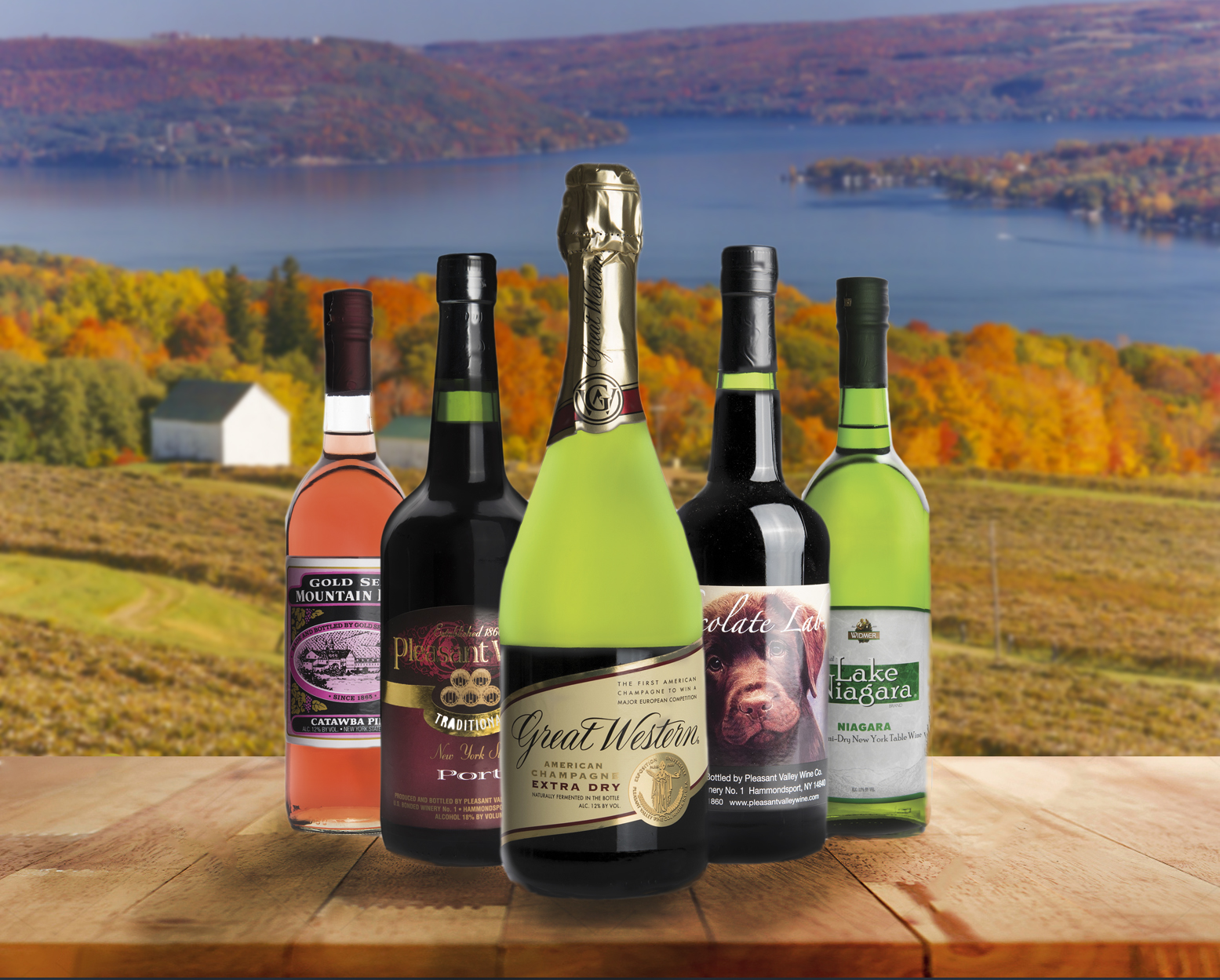
Once we had established a library of images, we could then incorporate these images into the site – not only visually to enhance the user experience, but for the functionality of building the e-commerce portion of the site. The old site only listed the products. We took the products into our studio and photographed them so the user would have a traditional shop to browse.
Before
