Branding / Case Studies / B2C / Web Design
Feast Your Eyes on Binghamton Restaurant Design
Spring Restaurant Week is wrapping up in Binghamton – and the team at Idea Kraft is celebrating another successful Restaurant Week redesign. But our work in the area’s food and beverage scene runs even deeper than this bi-annual event.
As the thriving Binghamton culinary scene has grown and evolved over the years, Idea Kraft has been there to provide menu design, branding, packaging, digital assets, and so much more. The results have been pretty delicious.
This year, we thought we’d look back on some of the work we’ve done at home and beyond. Let’s dig in.
The evolution of Restaurant Week materials.
Every year, Idea Kraft redesigns the look of eatBING’s bi-annual Restaurant Week, as well as the Martini Walk and Wine & Tapas event. That design is then adapted for social media graphics, posters, postcards, menus, and print ads.
Our early Restaurant Week material drew inspiration from the work of an earlier project, the first hello Binghamton guidebook (which you can read about below). In that era, high-end photography of mouthwatering dishes was the main course.
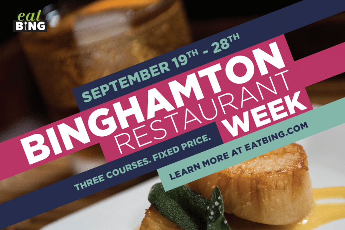
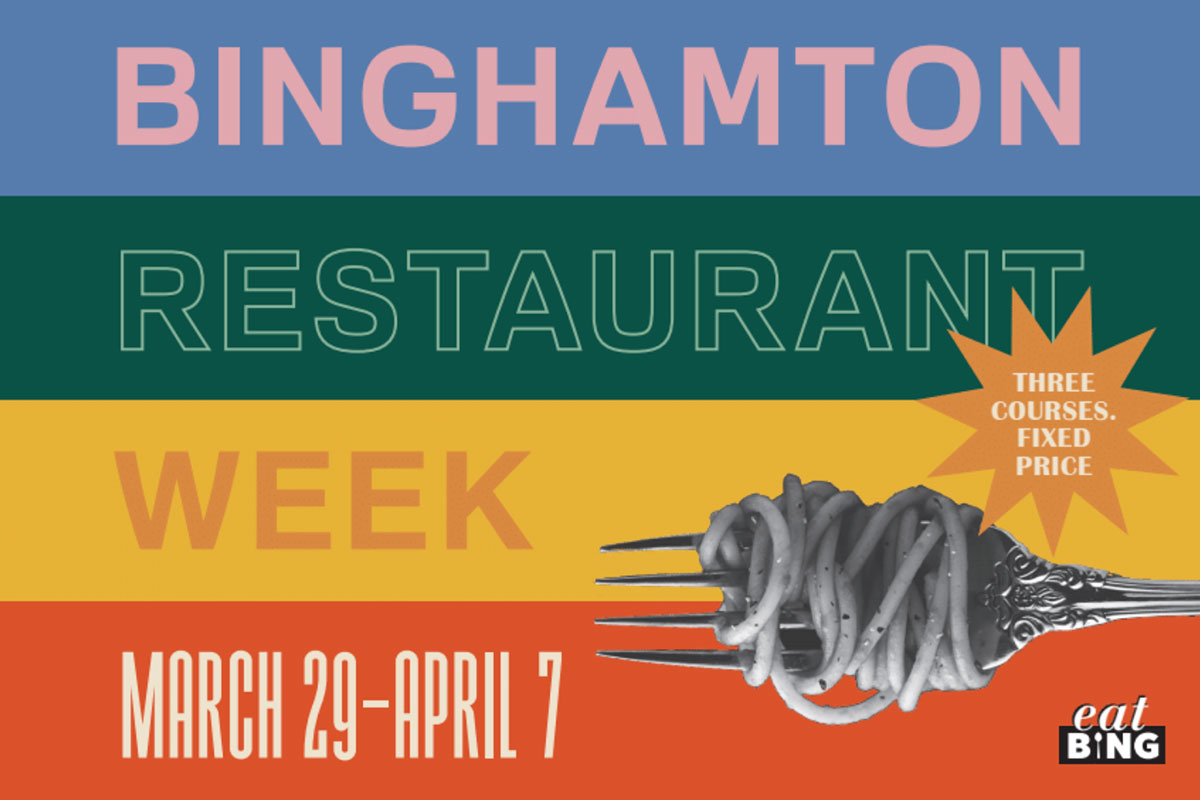
Nowadays, our designs incorporate Binghamton locales, as well as illustrations and typography-only solutions. We look forward to eatBING’s festivities as an opportunity to have fun and lean into playfulness.
We’re grateful that the folks at eatBING trust our judgment and give us the freedom to explore some of these fun concepts.
Appetizing website and packaging design.
There are certain things every restaurant website should have (more on that here). And Idea Kraft has had the pleasure of helping several eateries find their look – which makes it easier for loyal customers to find them. Here are just a few examples:
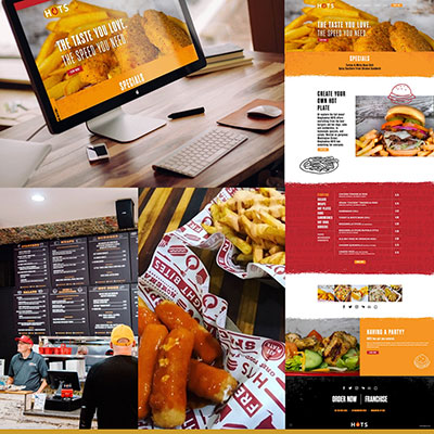
Binghamton HOTS: We provided website design and development, as well as packaging and store graphics, for this local staple. We prioritized personality and clarity, so customers understand exactly who Binghamton HOTS is and what they offer.
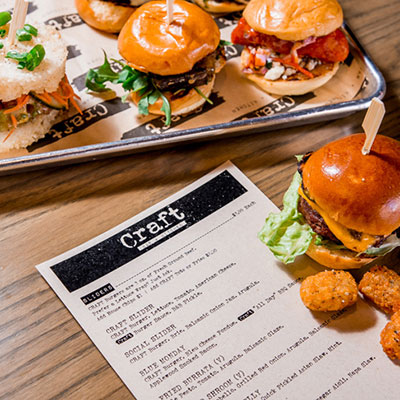
Craft: Our team designed a standout menu for a standout bar and burger joint. Craft’s menu is easy to scan for items, price, and ingredient information. Its well-organized and aesthetically pleasing presentation earned a feature spot on UnderConsideration’s Art of the Menu.
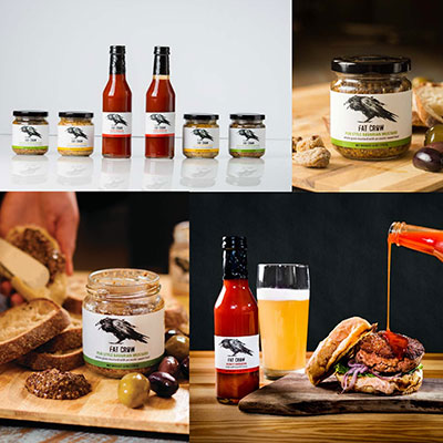
Fat Crow: Imagery is essential for a restaurant. It might be even more important for a gourmet condiment company like Fat Crow. Our photography and packaging design work helps customers envision the mouthwatering food they can make with Fat Crow products.
Capturing the big picture with hello, Binghamton.
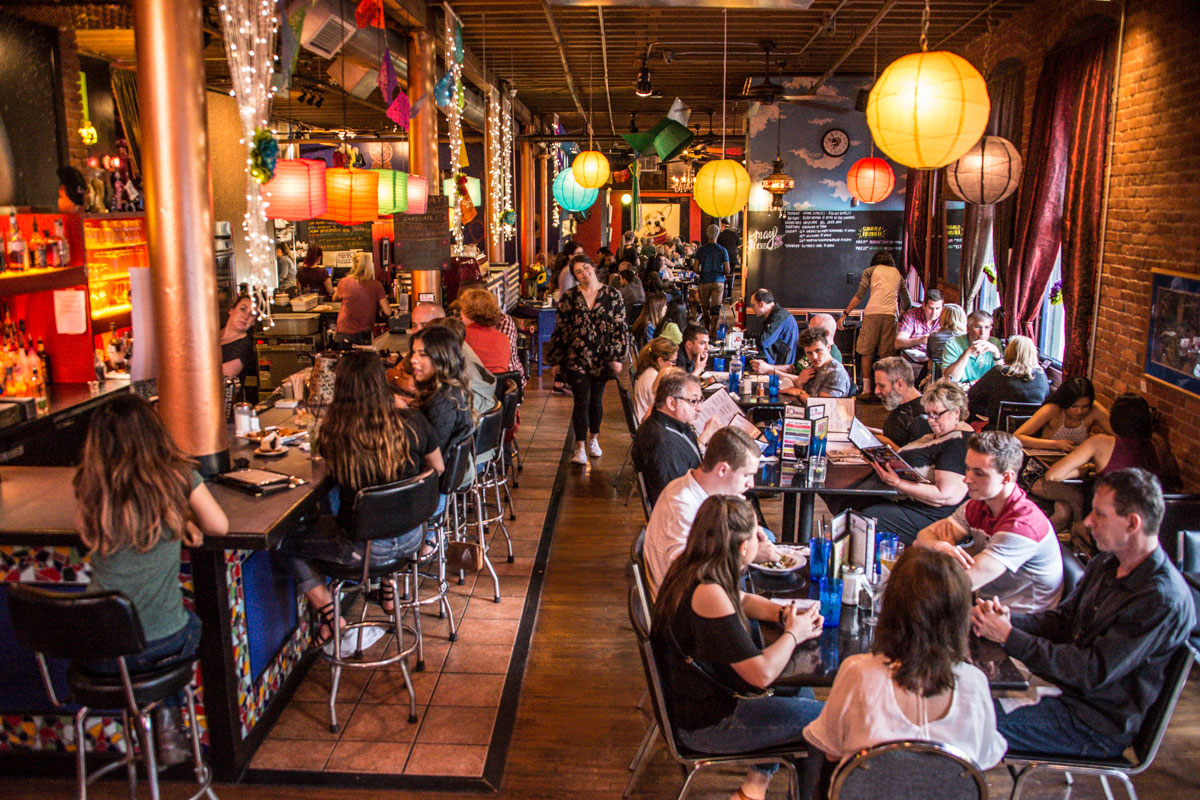
EatBING is a group of small business owners who are dedicated to promoting the Binghamton restaurant and bar scene. As locals may know, eatBING is an active organization with several events throughout the year.
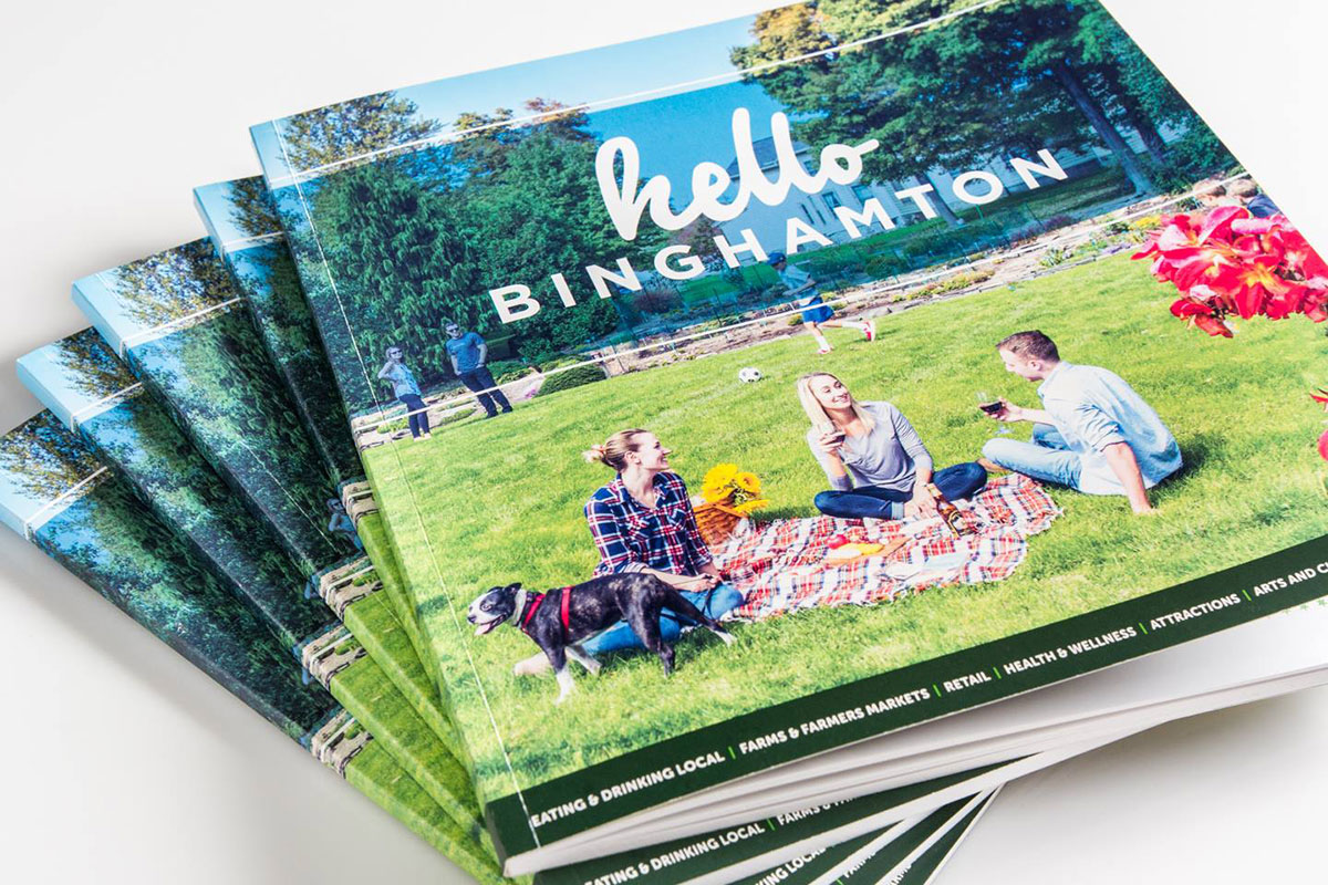
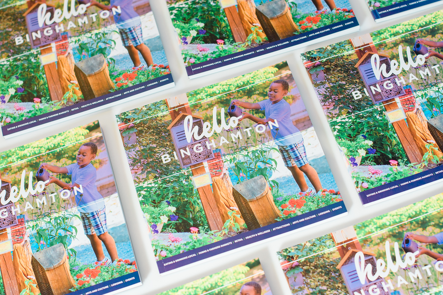
When eatBING decided to produce a culinary tourism guidebook, hello, Binghamton, they came to Idea Kraft.
The first iteration of hello, Binghamton was a comprehensive overview of the area’s culinary and cultural offerings with a heavy agritourism focus. The next two editions pivoted a bit to emphasize the area’s plethora of restaurants, bars, festivals, boutiques, and other attractions.
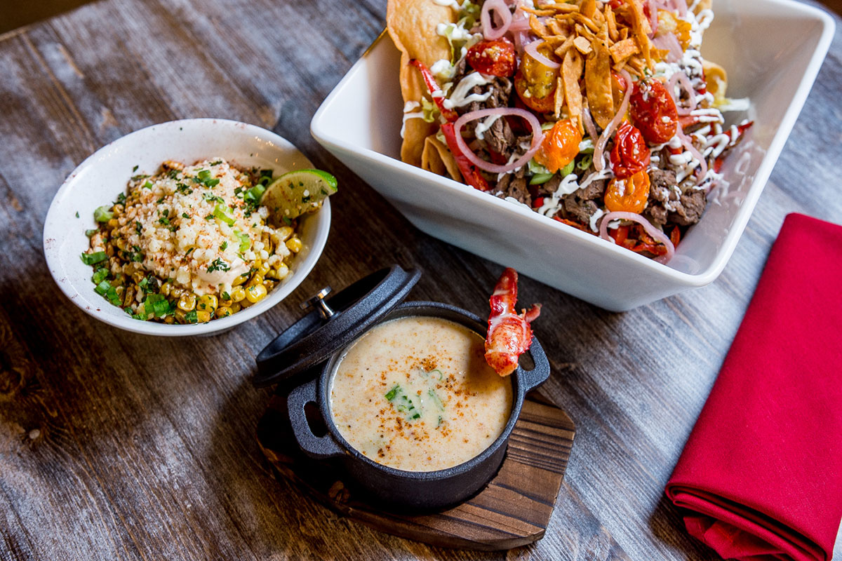
But one thing never changed: our stunning, full-color photography of delicious meals, impressive locales, up-and-coming restaurants, and locally grown produce.
Idea Kraft shot photography and handled all art direction on the photoshoots, from food styling to action shots that best represented each business. We also crafted sharp copy for all three editions of the hello, Binghamton books, which have come to showcase the area’s greatest strengths and cultural growth throughout the years.
We always love having a new edition in the works. It’s not every day we get to work on a physical product that uplifts and excites a community like hello, Binghamton does.
Eat on, Binghamton!
Creating designs for beloved local restaurants and culinary events is no easy feat. But it’s a challenge we’re always glad to have on our plate.
Your inbox needs more Idea Kraft.
